Been trying to get this working for a couple of days now without any luck.
This is dedicated for a larger monitor (2560x1080).. so lower viewport responsiveness doesnt matter.
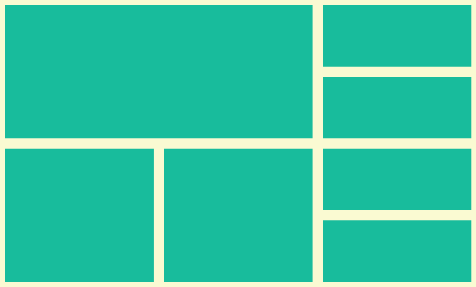
I'm trying to:
- Make container fit large full screen edge to edge.
- Create a grid (i.e. like the one in attached image)
- Display images in that grid cells that use exactly 100% of the space available to them (based on the % values of the underlying cell/div) -- so resize with aspect ratio and then stretch or something like that.
Unfortunately every attempt is just a mess... most recently I'm using bootstrap 4 with the following extra css
https://codepen.io/jpub/pen/qBNbGOV
#mmenu_screen > .row {
    min-height: 100vh;
}
    .flex-fill {
    flex:1 1 auto;
}
Any tips would be appreciated.
It should look like this.......

no bootstrap or framework needed CSS grid got you covered ;) it's a simple API read the CSS and you will understand how does it work you just add the needed divs then you give it literally a template and he will arrange them for you it's 100% responsive (to the limit for sure of the content).
hope I have helped