I have a slider on my page to change the box-shadow values. At some high blurring values there is an unwanted box-like breaking the shadow, when it is supposed to be a smooth shadow all the way. Is there anyway to avoid this easily? Thanks for the help. P. S. I actually need it to work with 'inset' too.
div
{
  width:200px;
  height:200px;
  border-radius: 100px;
 background-color:blue;
 -webkit-box-shadow: 169px 129px 300px -15px rgba(0,0,0,1);
 -moz-box-shadow: 169px 129px 300px -15px rgba(0,0,0,1);
 box-shadow: 169px 129px 300px -15px rgba(0,0,0,1);
}
<div></div>
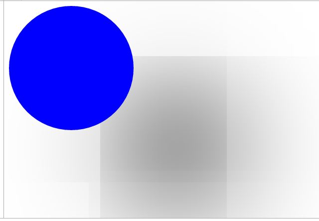
For circular
box-shadowsthe blur cannot go above the width & height of the element. The spread can though.Since your element is
200px * 200px, the maximum for the blur value is200px.Have a look below at the example which doesn't go above
200pxand you will see that it creates thebox-shadowas expectedThe spread value can alternatively go above the element width and height and therefore you can make bigger spreads.
You also didn't really need the prefixes since CSS3 Box-shadows are very well supported now. CanIUse
You can read more about CSS Box shadows in the MDN Documentation