Breaking one big list into horizontal multi-column list Bootstrap 3

10.8k Views Asked by At

I'm trying to break two ul lists of jobs under the two headers, "Job Categories" and "Job Function,"into multiple columns, columns not necessarily the same height, and responsive. Otherwise, the single column lists are too long. These two headers and lists should be inline (horizontal). This obviously needs to be responsive for mobile as well.

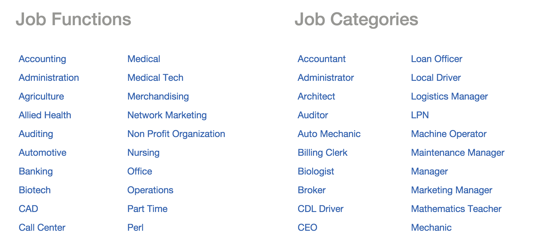
What's the best way to do this? Visual example below: enter image description here

3

There are 3 best solutions below

0
On BEST ANSWER

Using the grid system, one could "break-up the cells" of the bootstrap grid system:

<div class="container">
      <!--  Content Area-->
      <div class="row">
        <div class="col-md-5 col-sm-6">
          <div class="row">
            <h2 class="">Job Functions</h2>
          </div>
          <div class="row">
            <div class="col-md-4 col-sm-4">
              <div class="row content">
                <ul class="list-unstyled">
                 <li>,</li>
                 <li>,</li>
                </ul>
              </div>
            </div>
          </div>
          <div class="row">
            <div class="col-md-4 col-sm-4">
              <div class="row content">
                <ul class="list-unstyled">
                 <li>,</li>
                 <li>,</li>
                </ul>
              </div>
            </div>
          </div>
        </div>
        <div class="col-md-6 col-sm-5">
          <div class="row">
            <h2 class="">Job Categories</h2>
          </div>
          <div class="row">
            <div class="col-md-4 col-sm-4">
              <div class="row content">
                <ul class="list-unstyled">
                 <li>,</li>
                 <li>,</li>
                </ul>
              </div>
            </div>
            <div class="row">
            <div class="col-md-4 col-sm-4">
              <div class="row content">
                <ul class="list-unstyled">
                 <li>,</li>
                 <li>,</li>
                </ul>
              </div>
            </div>
            <div class="row">
            <div class="col-md-4 col-sm-4">
              <div class="row content">
                <ul class="list-unstyled">
                 <li>,</li>
                 <li>,</li>
                </ul>
              </div>
            </div>
          </div>
        </div>
      </div>
</div>  

It worked. Enjoy!

0
On

Try this

<ul class="col-md-6 col-sm-6 col-xs-12">
    <li class="col-xs-12"><h2>Job Function</h2></li>
    <li class="col-md-6 col-sm-6 col-xs-12">List 1</li>
    <li class="col-md-6 col-sm-6 col-xs-12">List 2</li>
<ul>

<ul class="col-md-6 col-sm-6 col-xs-12">
    <li class="col-xs-12"><h2>Job Categories</h2></li>
    <li class="col-md-6 col-sm-6 col-xs-12">List 1</li>
    <li class="col-md-6 col-sm-6 col-xs-12">List 2</li>
<ul>
2
On

<div class="col-md-6">

Bootstrap breaks a page/div down into 12 "columns" inside the class .container. This way you're giving half of that space to one of your headers and it'll be mobile-friendly.

I hope this isn't a gross oversimplification but given the information available it seems right.