Heya everyone,
I try to create a native element extension for < option> elements with polymer. The Idea is, to make more complex descriptive texts for options, stylable for usability.
Usability problem:
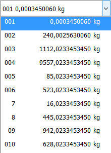
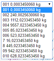
It is not a big thing, but a project (service side rendering) i was working on usability. Especialy Visual updates. So i found a selection for some items whichs options show their information unaligned and uneasy to read.
<option value="1">Magnesium 43,005344632 kg</option>
<option value="2">Magnesium 0,001234556 kg</option>
<option value="3">Magnesium 1037,012443111 kg</option>
The actual project sometimes shows more then 10 of such options with varying middle decimal numbers.
My Idea:
Im developing my experimental-component with the prepared project setup from the polymer-cli that is intended to build standalone webcomponents (So results are rendered inside an < iframe >) with the help of < iron-component-page >.
<link rel="import" href="bower_components/polymer/polymer.html">

<!--
`special-option` is an extension for option elements.
Example:

    <select name="options">
      <option is="special-option" value="1">option 1</option>
      <option is="special-option" value="2">option 2</option>
      <option is="special-option" value="3">option 3</option>
    </select>


### Styling

Custom property | Description | Default
----------------|-------------|----------
`--special-option` | Mixin applied to special-option | `{}`
`--special-option-container` | Mixin applied to the container of values | `{}`
`--special-option-value-a` | Mixin applied to the first value | `{}`
`--special-option-value-b` | Mixin applied to the second value | `{}`
`--special-option-value-c` | Mixin applied to the third value | `{}`


@demo demo/index.html
-->
<dom-module id="special-option">
    <template>
    <style is="custom-style">
      :host {
        @apply(--special-option);
      }

      #container {
        @apply(--special-option-container);
      }

      span {
        @apply(--special-option-values);
      }

      .value-a {
        @apply(--special-option-value-a);
      }

      .value-b {
        @apply(--special-option-value-b);
      }

      .value-c {
        @apply(--special-option-value-c);
      }
    </style>

    <div id="container">
      <span class="value-a"> [[valueA]] </span>
      <span class="value-b"> [[valueB]] </span>
      <span class="value-c"> [[valueC]] </span>
    </div>

  </template>

    <script>
        window.addEventListener('WebComponentsReady', function(e) {
            // imports are loaded and elements have been registered
            console.log('Components are ready');
            Polymer({
                is: 'special-option',

                extends: 'option',

                properties: {
                    /**
                     * First value to be shown.
                     * @type {String}
                     */
                    valueA: {
                        type: String,
                        reflectToAttribute: true
                    },
                    /**
                     * Second value to be shown.
                     * @type {String}
                     */
                    valueB: {
                        type: String,
                        reflectToAttribute: true
                    },
                    /**
                     * Third value to be shown.
                     * @type {String}
                     */
                    valueC: {
                        type: String,
                        reflectToAttribute: true
                    },
                },

            });
        });
    </script>
</dom-module>
A webcomponent that extends native < option > elements with stylable markup. Styling for developers would be achieved by overriding custom CSS properties as a "styling API".
<style is="custom-style" include="demo-pages-shared-styles">
  option[is="special-option"] {
     --special-option-container: { @apply(--layout-horizontal); direction: ltr; } ;
     --special-option-values: { @apply(--layout-flex); @apply(--layout-horizontal); min-height: 3vh; } ;
     --special-option-value-a: { direction: rtl; min-width: 25px; max-width: 25px; } ;
     --special-option-value-b: { direction: rtl; min-width: 150px; max-width: 150px; } ;
     --special-option-value-c: { margin-left: 1vw; } ;
  }
</style>
inside the < demo-snippet >
<select name="options">
  <option is="special-option"  value="1" value-a="Magnesium" value-b="43,005344632" value-c="kg">
  </option>
  <option is="special-option"  value="2" value-a="Magnesium" value-b="0,001234556" value-c="kg">
  </option>
  <option is="special-option"  value="3" value-a="Magnesium" value-b="1037,012443111" value-c="kg">
  </option>
</select>
The outcome should be so that the middle value-b allways has a min-width, therefor aligning the long values.
My shots at trying to fix this problem, circled arround how i polyfill (webcomponents-lite.js or the full polyfill) and how i configure the window.Polymer Object for the iframe, and the first page (the automaticly rendered Documentation Page).
Results so far
As with dom: 'shady' configuration
I succeeded so far to let native < select > work with these extended buttons. So the lifecycles are working and the option tags are extended.
But while it works as intended on Firefox, it does not work in chrome (options still work, but styling is not aplied).
When i configured the window.polymer configuration object with dom: 'shadow',
chrome reported:
Failed to execute 'createShadowRoot' on 'Element': Shadow root cannot be created on a host which already hosts an user-agent shadow tree. at HTMLOptionElement._createLocalRoot (http://localhost:9001/components/special-option/bower_components/polymer/polymer-mini.html:2001:6)
Thanks to @Supersharp i got new insights: Since Webcomponents V1 is not allowing to create multiple shadow-roots (option allready has one itself), going for true shadow dom wont be the right way, yet.
- Firefox still produced the same result (obviously because of the polyfill forcing shady dom anyway)
prior question
Is there something im doing wrong, or is this not achievable with option tags in every browser even when polyfilled?
But as the polymer documentation recommends, im trying to develop for a polyfilled platform for now (configure dom: 'shady').
The Question
Am i right that this is not possible (yet)(even with shady dom polyfill)? So i'd have to create a whole < select > or < form > set of custom elements?