I'm working on an SVG gauge meter here I want to divide the semi-circle into parts when the range slider move on active stroke fill with gradient color. And want to add one more black color running track when the meter needle moves. I had tried using stroke-dasharray but after adding this all colors are coming at a time meter is not working properly.
- I want to divide the semi-circle into parts when the range slider move on active stroke fill with gradient color
- And I want to add one more black color running track when the meter needle moves.
My code here
/* set radius for all circles */
var r = 400;
var circles = document.querySelectorAll('.circle');
var total_circles = circles.length;
for (var i = 0; i < total_circles; i++) {
  circles[i].setAttribute('r', r);
}
/* set meter's wrapper dimension */
var meter_dimension = (r * 2) + 100;
var wrapper = document.querySelector('#wrapper');
wrapper.style.width = meter_dimension + 'px';
wrapper.style.height = meter_dimension + 'px';
/* add strokes to circles  */
var cf = 2 * Math.PI * r;
var semi_cf = cf / 2;
var semi_cf_1by3 = semi_cf / 3;
var semi_cf_2by3 = semi_cf_1by3 * 2;

document.querySelector('#outline_curves').setAttribute('stroke-dasharray', semi_cf + ',' + cf);
document.querySelector('#high').setAttribute('stroke-dasharray', semi_cf + ',' + cf);
document.querySelector('#avg').setAttribute('stroke-dasharray', semi_cf_2by3 + ',' + cf);
document.querySelector('#low').setAttribute('stroke-dasharray', semi_cf_1by3 + ',' + cf);
document.querySelector('#outline_ends').setAttribute('stroke-dasharray', 2 + ',' + (semi_cf - 2));
document.querySelector('#mask').setAttribute('stroke-dasharray', semi_cf + ',' + cf);
/*bind range slider event*/
var slider = document.querySelector('#slider');
var lbl = document.querySelector("#lbl");
var mask = document.querySelector('#mask');
var meter_needle = document.querySelector('#meter_needle');

function range_change_event() {
  var percent = slider.value
  var meter_value = semi_cf - ((percent * semi_cf) / 100);
  mask.setAttribute('stroke-dasharray', meter_value + ',' + cf);
  meter_needle.style.transform = 'rotate(' + (450 - ((percent * 180) / 100)) + 'deg)';
  lbl.textContent = percent + '%';
}
slider.addEventListener('input', range_change_event);
#wrapper {
position: relative;
margin: auto;
}
#meter {
width: 100%;
height: 100%;
transform: rotate(180deg);
}
.circle {
fill: none;
}
.outline,
#mask {
stroke: #F1F1F1;
stroke-width: 65;
}
.range {
stroke-width: 60;
}
#slider,
#lbl {
position: absolute;
}
#slider {
position: absolute;
transform: rotate(180deg);
cursor: pointer;
left: 0;
margin: auto;
right: 0;
top: 58%;
width: 94%;
}
#lbl {
background-color: #4B4C51;
border-radius: 2px;
color: white;
font-family: 'courier new';
font-size: 15pt;
font-weight: bold;
padding: 4px 4px 2px 4px;
right: -48px;
top: 57%;
}
#meter_needle {
height: 40%;
left: 0;
margin: auto;
position: absolute;
right: 0;
top: 10%;
transform-origin: bottom center;
/*orientation fix*/
transform: rotate(450deg);
width: 5px;
background-color: red;
}<script src="https://cdnjs.cloudflare.com/ajax/libs/jquery/3.3.1/jquery.min.js"></script>
<body>
<div id="wrapper">
<svg id="meter">
<circle id="outline_curves" class="circle outline" cx="50%" cy="50%">
</circle>
<circle id="high" class="circle range" cx="50%" cy="50%" stroke="#FDE47F">
</circle>
<circle id="avg" class="circle range" cx="50%" cy="50%" stroke="#7CCCE5">
</circle>
<circle id="low" class="circle range" cx="50%" cy="50%" stroke="#E04644">
</circle>
<circle id="mask" class="circle" cx="50%" cy="50%" >
</circle>
<circle id="outline_ends" class="circle outline" cx="50%" cy="50%">
</circle>
</svg>
<svg version="1.1" id="meter_needle" xmlns="http://www.w3.org/2000/svg" xmlns:xlink="http://www.w3.org/1999/xlink" x="0px" y="0px" width="16.721px" height="93.834px" viewBox="0 0 16.721 93.834" enable-background="new 0 0 16.721 93.834" xml:space="preserve">
<path fill="#464646" d="M13.886,84.243L2.83,83.875c0,0,3.648-70.77,3.956-74.981C7.104,4.562,7.832,0,8.528,0
c0.695,0,1.752,4.268,2.053,8.894C10.883,13.521,13.886,84.243,13.886,84.243z"/>
<path fill="#464646" d="M16.721,85.475c0,4.615-3.743,8.359-8.36,8.359S0,90.09,0,85.475c0-4.62,3.743-8.363,8.36-8.363
S16.721,80.855,16.721,85.475z"/>
<circle fill="#EEEEEE" cx="8.426" cy="85.471" r="2.691"/>
</svg>
<input id="slider" type="range" min="25" max="100" step="25" value="0" />
<label id="lbl" id="value" for="">0%</label>
</div>
<script src="script.js"></script>
</body>Can anyone suggest to me how to achieve this output. Any help will be appreciate.
<script src="https://cdnjs.cloudflare.com/ajax/libs/jquery/3.2.1/jquery.min.js"></script>

<svg version="1.1" id="Layer_1" xmlns="http://www.w3.org/2000/svg" xmlns:xlink="http://www.w3.org/1999/xlink" x="0px" y="0px" width="65px" height="51.333px" viewBox="0 0 65 51.333" enable-background="new 0 0 65 51.333" xml:space="preserve">
<g>
    <defs>
        <rect id="SVGID_1_" x="-157.417" y="-176.417" width="648" height="864"/>
    </defs>
    <clipPath id="SVGID_2_">
        <use xlink:href="#SVGID_1_"  overflow="visible"/>
    </clipPath>
    <g clip-path="url(#SVGID_2_)">
        <defs>
            <rect id="SVGID_3_" x="-157.417" y="-176.417" width="648" height="864"/>
        </defs>
        <clipPath id="SVGID_4_">
            <use xlink:href="#SVGID_3_"  overflow="visible"/>
        </clipPath>
    </g>
    <g clip-path="url(#SVGID_2_)">
        <defs>
            <rect id="SVGID_5_" x="-157.417" y="-176.417" width="648" height="864"/>
        </defs>
        <clipPath id="SVGID_6_">
            <use xlink:href="#SVGID_5_"  overflow="visible"/>
        </clipPath>
    </g>
    <g clip-path="url(#SVGID_2_)">
        <defs>
            <rect id="SVGID_7_" x="-157.417" y="-176.417" width="648" height="864"/>
        </defs>
        <clipPath id="SVGID_8_">
            <use xlink:href="#SVGID_7_"  overflow="visible"/>
        </clipPath>
        <path clip-path="url(#SVGID_8_)" fill="#FFFFFF" d="M19.527,44.274c-1.653,5.015-7.059,7.738-12.071,6.085
            c-5.015-1.654-7.739-7.058-6.087-12.071c1.652-5.015,7.058-7.739,12.072-6.084C18.456,33.855,21.179,39.26,19.527,44.274"/>
        <path clip-path="url(#SVGID_8_)" fill="#58595B" d="M19.514,44.289c-1.652,5.013-7.056,7.736-12.066,6.083
            c-5.014-1.653-7.736-7.056-6.084-12.067c1.652-5.013,7.055-7.736,12.068-6.083C18.443,33.875,21.166,39.277,19.514,44.289"/>
        <path clip-path="url(#SVGID_8_)" fill="#FFFFFF" d="M17.318,43.564c-1.253,3.801-5.35,5.865-9.15,4.612
            c-3.797-1.253-5.863-5.35-4.609-9.148c1.254-3.8,5.349-5.865,9.148-4.612C16.506,35.67,18.57,39.766,17.318,43.564"/>
        <path clip-path="url(#SVGID_8_)" fill="#58595B" d="M19.266,34.944c2.242,3.113,2.33,7.115,0.57,10.255l45.249-43.24L9.721,31.148
            C13.256,30.475,17.023,31.828,19.266,34.944"/>
        <defs>
            <filter id="Adobe_OpacityMaskFilter" filterUnits="userSpaceOnUse" x="6.52" y="-11.184" width="62.369" height="60.661">
                <feFlood  style="flood-color:white;flood-opacity:1" result="back"/>
                <feBlend  in="SourceGraphic" in2="back" mode="normal"/>
            </filter>
        </defs>
        <mask maskUnits="userSpaceOnUse" x="6.52" y="-11.184" width="62.369" height="60.661" id="SVGID_9_">
            <g filter="url(#Adobe_OpacityMaskFilter)">
                <g enable-background="new    ">
                    <g enable-background="new    ">
                        <g>
                            <defs>
                                <path id="SVGID_10_" d="M17.516,29.352c2.243,0.335,3.028,2.134,3.028,2.134L57.891,6.807L17.516,29.352z"/>
                            </defs>
                            <clipPath id="SVGID_11_" clip-path="url(#SVGID_8_)">
                                <use xlink:href="#SVGID_10_"  overflow="visible"/>
                            </clipPath>
                            <defs>

                                    <filter id="Adobe_OpacityMaskFilter_1_" filterUnits="userSpaceOnUse" x="6.52" y="-11.184" width="62.369" height="60.661">
                                    <feFlood  style="flood-color:white;flood-opacity:1" result="back"/>
                                    <feBlend  in="SourceGraphic" in2="back" mode="normal"/>
                                </filter>
                            </defs>
                            <mask maskUnits="userSpaceOnUse" x="6.52" y="-11.184" width="62.369" height="60.661" id="SVGID_9_">
                                <g filter="url(#Adobe_OpacityMaskFilter_1_)">
                                    <g enable-background="new    ">
                                    </g>
                                </g>
                            </mask>

                                <linearGradient id="SVGID_12_" gradientUnits="userSpaceOnUse" x1="-236.1787" y1="699.8169" x2="-235.1792" y2="699.8169" gradientTransform="matrix(36.5072 -22.3825 22.3825 36.5072 -7021.3823 -30804.627)">
                                <stop  offset="0" style="stop-color:#FFFFFF"/>
                                <stop  offset="0.0466" style="stop-color:#D5D7D8"/>
                                <stop  offset="0.0983" style="stop-color:#B1B3B6"/>
                                <stop  offset="0.1557" style="stop-color:#929497"/>
                                <stop  offset="0.2174" style="stop-color:#797A7D"/>
                                <stop  offset="0.2847" style="stop-color:#626366"/>
                                <stop  offset="0.3595" style="stop-color:#4E4E50"/>
                                <stop  offset="0.445" style="stop-color:#3B3B3C"/>
                                <stop  offset="0.5476" style="stop-color:#202021"/>
                                <stop  offset="0.6848" style="stop-color:#080809"/>
                                <stop  offset="1" style="stop-color:#000000"/>
                            </linearGradient>
                            <polygon clip-path="url(#SVGID_11_)" mask="url(#SVGID_9_)" fill="url(#SVGID_12_)" points="28.547,49.477 68.889,24.744
                                46.861,-11.184 6.52,13.549                          "/>
                        </g>
                    </g>
                </g>
            </g>
        </mask>
        <g opacity="0.8" clip-path="url(#SVGID_8_)">
            <g>
                <defs>
                    <rect id="SVGID_13_" x="6.52" y="-11.184" width="62.369" height="60.661"/>
                </defs>
                <clipPath id="SVGID_14_">
                    <use xlink:href="#SVGID_13_"  overflow="visible"/>
                </clipPath>
                <g clip-path="url(#SVGID_14_)">
                    <defs>
                        <path id="SVGID_15_" d="M17.516,29.352c2.243,0.335,3.028,2.134,3.028,2.134L57.891,6.807L17.516,29.352z"/>
                    </defs>
                    <clipPath id="SVGID_16_">
                        <use xlink:href="#SVGID_15_"  overflow="visible"/>
                    </clipPath>

                        <linearGradient id="SVGID_17_" gradientUnits="userSpaceOnUse" x1="-236.1787" y1="699.8169" x2="-235.1792" y2="699.8169" gradientTransform="matrix(36.5072 -22.3825 22.3825 36.5072 -7021.3823 -30804.627)">
                        <stop  offset="0" style="stop-color:#FFFFFF"/>
                        <stop  offset="0.1467" style="stop-color:#FFFFFF"/>
                        <stop  offset="1" style="stop-color:#FFFFFF"/>
                    </linearGradient>
                    <polygon clip-path="url(#SVGID_16_)" fill="url(#SVGID_17_)" points="28.547,49.477 68.889,24.744 46.861,-11.184 6.52,13.549
                                            "/>
                </g>
            </g>
        </g>
        <path clip-path="url(#SVGID_8_)" fill="#58595B" d="M12.709,42.044c-0.412,1.254-1.765,1.936-3.02,1.523
            c-1.253-0.414-1.934-1.765-1.52-3.019c0.412-1.253,1.764-1.936,3.017-1.521C12.44,39.441,13.121,40.792,12.709,42.044"/>
    </g>
</g>
</svg>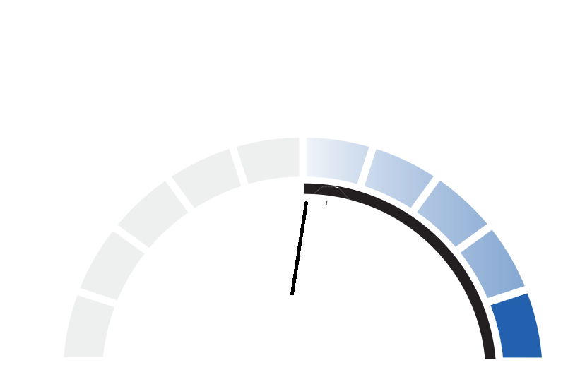


Here's a working SVG example, with a little bit of javascript.
It's not clear from your question what exactly you want the coloured divisions to look like. For now I've just made them solid red. But you can make them look however you'd like by changing the
fillof the<rect id="meter-colours" .../>.Update re new needle image
First let's simplify your needle image:
To use this in your meter, we'll need to locate an accurate centre of rotation (the dot in the circle), and re-orient it so that it has zero angle. We may also need to adjust its scale to fit the meter.
By analysis and experimentation, the centre of rotation is at
(10.44, 41.3)and the rotation needed to zero out the rotation is35.8 deg.Since the meter is centred at
(0,0)we need to start by shifting and rotating the new needle by those amounts.The needle is now horizontal, and positioned at (0,0).
We can now integrate it into the previous solution: