Flutter. Is it possible to change TextFormField errorText padding?

4.5k Views Asked by At

I'm using TextFormField with OutlineInputBorder. I need the text inside to have padding on the right and left. For this I'm using:

 contentPadding: const EdgeInsets.symmetric(vertical: 4, horizontal: 8),

Everything works well. However, I also use a validator. And if an incorrect value is entered in the field, an error is displayed.

But I need the padding to not apply to the error. Can you tell me if this can be achieved? For an example, look at the picture: enter image description here

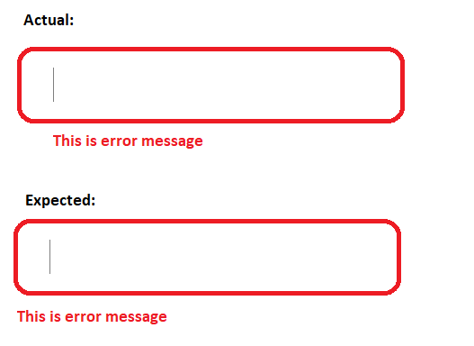
Is it possible to change padding only for my error text ?

Please, help me.

3

There are 3 best solutions below

0
On BEST ANSWER

there is no possible solution at this time . if we inspect the TextFormField , the contentPadding also control the error text to

but we can achieve that

this is my code

  final GlobalKey<FormState> _formKey = GlobalKey<FormState>();
  bool onError = false;
  @override
  Widget build(BuildContext context) {
    return Scaffold(
      appBar: AppBar(),
      body: SingleChildScrollView(
        padding: EdgeInsets.all(10),
        child: Column(
          children: [
            Form(
                key: _formKey,
                child: Container(
                    padding: EdgeInsets.only(
                        left: 20, right: 20, top: 20, bottom: 20),
                    child: Stack(children: [
                      Container(
                          padding: EdgeInsets.only(bottom: 20),
                          child: TextFormField(
                            style: TextStyle(color: Colors.amber, fontSize: 14),
                            controller: emailEditingController,
                            decoration: InputDecoration(
                              alignLabelWithHint: true,
                              floatingLabelBehavior:
                                  FloatingLabelBehavior.never,
                              contentPadding: EdgeInsets.fromLTRB(30, 5, 10, 5),
                              labelText: "Enter Email",
                              border: OutlineInputBorder(
                                borderRadius: BorderRadius.circular(30.0),
                              ),
                              labelStyle: TextStyle(
                                  color: Colors.grey.shade400, fontSize: 14),
                            ),
                            validator: (String? value) {
                              setState(() {
                                onError = false;
                              });
                              if (value!.isEmpty) {
                                setState(() {
                                  onError = true;
                                });
                                return null;
                              }
                              return null;
                            },
                          )),
                      onError
                          ? Positioned(
                              bottom: 0,
                              child: Text('this is an error msg',
                                  style: TextStyle(color: Colors.red)))
                          : Container()
                    ]))),
            MaterialButton(
                key: Key('login'),
                minWidth: 150,
                height: 50,
                color: Colors.amber,
                child: Text('login'),
                onPressed: () {
                  FocusScope.of(context).requestFocus(FocusNode());
                  if (_formKey.currentState!.validate()) {}
                }),
          ],
        ),
      ),
     );
   }
}

note that

please don't add error message text, error message style , etc . because it will create a space

out put will be

enter image description here

0
On
        TextFormField(
          style: const TextStyle(color: Colors.green, fontSize: 14),
          controller: controller,
          decoration: InputDecoration(
            prefixIcon:
                Container(width: 10), // Give container some width.
            contentPadding: EdgeInsets
                .zero, // Set this to zero since no padding is needed.
            labelText: "Enter Email",
            border: OutlineInputBorder(
              borderRadius: BorderRadius.circular(8.0),
            ),

            labelStyle:
                TextStyle(color: Colors.grey.shade400, fontSize: 14),
          ),
          autovalidateMode: AutovalidateMode.onUserInteraction,
          textInputAction: TextInputAction.done,
          validator: (String? value) {
            if (value == null || value.isEmpty) {
              return "Please enter some text";
            }
            return null;
          },
        ),

As simple as this!

1
On

Try Padding on Prefix field

decoration: InputDecoration(
...
   contentPadding: const EdgeInsets.only(bottom: 0.0, top: 15.0),
   prefix: const Padding(
     padding: EdgeInsets.only(left: 20.0)),
     ),
...
),

for more check details please check this link