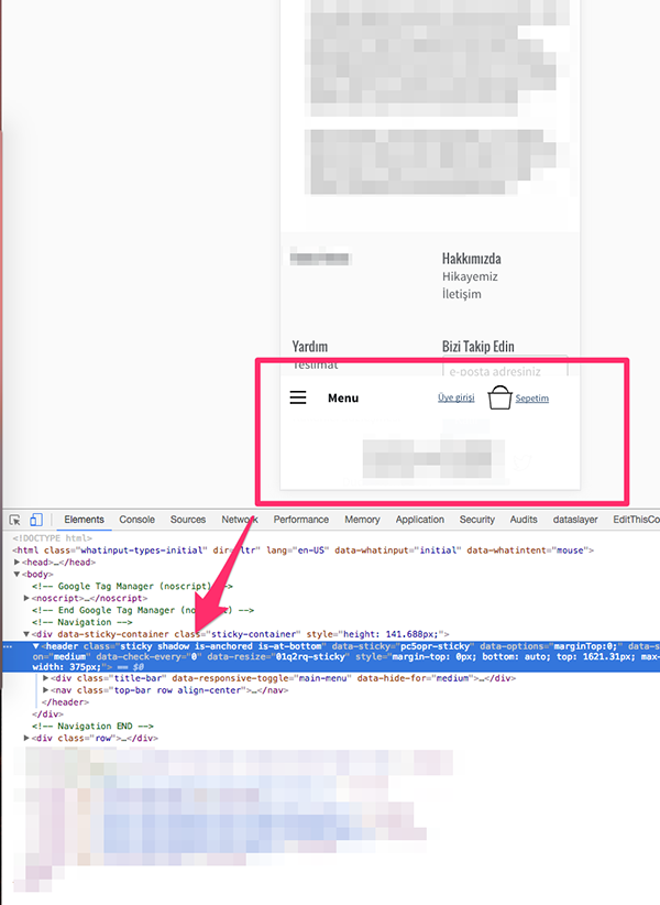
i made a sticky responsive menu and on mobile it jumps automatically and sticks to bottom. The class of the navigation element changes to .is-anchored .is-at-bottom
Here is some sample code from menu:
   <div data-sticky-container>
    <header class="sticky" data-sticky data-options="marginTop:0;" data-sticky-on="medium" data-check-every=0  >
        <div class="title-bar" data-responsive-toggle="main-menu" data-hide-for="medium">
            <button type="button" class="menu-icon dark" data-toggle></button>
            <div class="title-bar-title">Menu</div>

...
Menu works fine on large but on mobile and small screens it jumps and anchored to bottom.
How can i prevent this?

Duplicate issue of:
Foundation 6 Mobile Search Bar Sticking to Bottom on Android
For an explanation, the minimum breakpoint size for foundation's sticky, is at 'medium', so small screens won't be sticky, unless you otherwise intentionally specify the minimum breakpoint. (As seen in the issue linked above).