Grid nesting in CSS-frameworks

290 Views Asked by At

I don't understand grid nesting in (any of) CSS frameworks.

I'm using Foundation CSS framework with 24 colum grid — one column = 4.16667%, two — 8.33333%, twelve — 50%, etc.

This is my grid for 1920 pixel browser width — left part = 10 columns (41.66667%), right part = 14 columns (58.33333%) — Codepen.

Inside the right part there is a heading and a content block:enter image description here

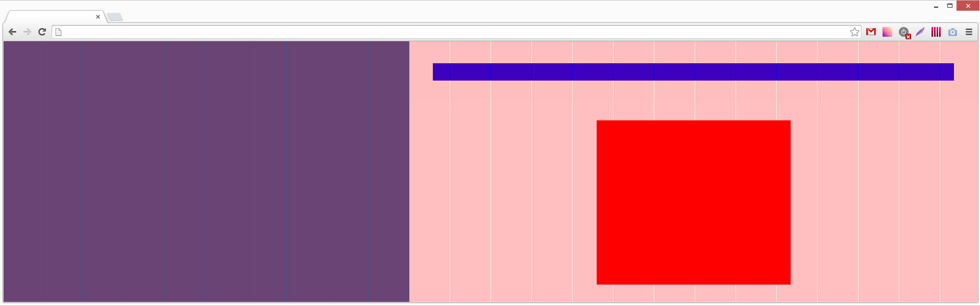
Heading has 1 column padding (in Foundation it is called «push»):

<div class="row small-padding-horizontal-1 medium-padding-horizontal-1 large-padding-horizontal-1 xlarge-padding-horizontal-1 xxlarge-padding-horizontal-1">…</div>

— as you see on the attached image heading does not fit the grid.

Content block is 5 columns wide:

<div class="small-5 medium-5 large-5 xlarge-5 xxlarge-5">…</div>

— as you see on the attached image this block does not fit the grid — it is not 5 columns wide.

And this is absolutely right and obvious — right block is 58.33333% wide, so all inner blocks' width percents will calculate accordingly this block width, not whole window width.

My question is — how do I fit the grid for my nested blocks which are inside parent blocks?

Codepen

3

There are 3 best solutions below

1
On

Responsive frameworks work with % width of parent divs..

Calculating according to your needs is a little bit trickier and messy at times.

If you look at your requirement you want to fit 5 column in a 14-column grid.

to achieve this you should do a calculation like this.

Your 14-column is now 24-column while nesting so 5-columns in 14-columns occupying a space of 35.174%.Considering 24 columns that would be 8.57 columns which is not a whole number so choose the one that is closest to it ( 8 or 9 columns).

But if you want to exactly have 5 in 14 columns i.e 60/7 in 24 columns you should have that as a whole number giving you .. 14*7 columns 10*7 colums and 5*7columns

Your grid should be 178-column with 70-columns to left and 98-columns to the right and 35-columns inside of 98-columns grid.

easier way write custom class for the 5 columns grid to occupy the 35.17%

0
On

Well, CSS frameworks provide a grid only for the first level blocks — all nested blocks should be manually calculated to fit top level grid.

This is calculations for the red block to fit the main grid (right container also changes column count depending of screen resolution):

@media screen and (max-width: 1920px) { width: (5 / 14 * 100 + 0%); } /* width — 5 columns, parent container — 14 columns -> 35.7% */
@media screen and (max-width: 1440px) { width: (7 / 18 * 100 + 0%); } /* width — 7 columns, parent container — 18 columns -> 38.88 */
@media screen and (max-width: 1280px) { width: (7 / 18 * 100 + 0%); } /* width — 7 columns, parent container — 18 columns */
@media screen and (max-width: 1024px) { width: (10 / 22 * 100 + 0%); } /* width — 10 columns, parent container — 22 columns */
@media screen and (max-width: 640px) { width: (16 / 24 * 100 + 0%); } /* width — 16 columns, parent container — 24 columns */

So, I'm no more using column classes in HTML and Foundation framework's grid.css file because it is totally useless.

0
On

Things work differently for every framework.

In Cascade Framework, a grid element basically just needs the col class, and you can infinitely nest col classes.

To easily allow for infinite nesting, grid elements have neither padding nor margin. For a consistent gutter across your page, you typically complement the col class with the the cell class as a wrapper for your content.

Example :

<div class="col width-1of2">
    <div class="col width-1of2">
        <div class="cell">
            [Content]
        </div>
    </div>
    <div class="col width-fill">
        <div class="col width-1of3">
            <div class="cell">
                [Content]
            </div>
        </div>
        <div class="col width-1of3">
            <div class="col width-3of5">
                <div class="cell">
                    [Content]
                </div>
            </div>
            <div class="col width-fill">
                <div class="cell">
                    [Content]
                </div>
            </div>
        </div>
        <div class="col width-fill">
            <div class="cell">
                [Content]
            </div>
        </div>
    </div>
</div>
<div class="col width-fill">
    <div class="col width-1of4">
        <div class="cell">
            [Content]
        </div>
    </div>
    <div class="col width-fill">
        <div class="col width-2of3">
            <div class="cell">
                [Content]
            </div>
        </div>
        <div class="col width-fill">
            <div class="cell">
                [Content]
            </div>
        </div>
    </div>
</div>

See also this demo and the official documentation.