I can't add my icon to the component.
https://codesandbox.io/s/materialuipickers-material-demo-forked-soctc
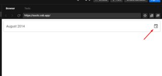
I can't add my icon to the component.
https://codesandbox.io/s/materialuipickers-material-demo-forked-soctc
 Aftab Ahmed
On
Aftab Ahmed
On
Just add the openPickerIcon property in slots of DatePicker, DateTimePicker etc to acheive it. (For adding custom svg icon)
 import CalendarIcon"../Components/CalendarIcon";

    //…

 <DatePicker
   slots={{
     openPickerIcon: CalendarIcon
    }}
/>
Create an SVG Component
import React from 'react';

import calendarSVG from './../calenderIcon/calendar.svg';

const CalendarIcon = () => (
  <img src={calendarSVG} alt="Calendar" />
);

export default CalendarIcon;
Copyright © 2021 Jogjafile Inc.
The
slotsprop ofDatePickerlets you override the inner components including theOpenPickerIcon, so this is how you override it:This is the list of icon components that can be customized:
https://mui.com/x/api/date-pickers/date-picker/#slots