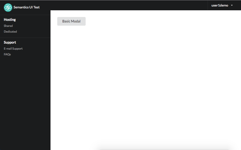
This is my first time trying to use Meteor with ReactJs and React Semantic UI, and having issues on rendering the Semantic UI modal. What I am trying to achieve is to click on the button and open up the modal overlaying on the whole browser, in reference to the React Semantic Modal Manual But what I have right now is that the modal is rendered partially on the screen, as seen from the attached screenshots. Can anyone please help? Thanks in advance.
Main.js
import {Meteor} from 'meteor/meteor';
import React from 'react';
import ReactDOM from 'react-dom';
import {routes} from "../imports/routes/routes";

Meteor.startup(() => {
    ReactDOM.render(routes, document.getElementById('app'));
});
Site.js:
import React from 'react';
import { Header, Button, Modal } from 'semantic-ui-react';

import PrivateHeader from './PrivateHeader';
import Sidebar from './Sidebar';
import ModalExample from './Modal';

export class Site extends React.Component {
render() {
        return (
            <div>
                <PrivateHeader/>
                <Sidebar/>
                <div className="page">
                    <div className="ui padded one column grid">
                        <div className="column">
                            <ModalExample/>
                        </div>
                    </div>
                </div>
            </div>
        );
    }
}
export default Site;
ModalExample.js
import React from 'react'
import { Button, Header, Icon, Modal } from 'semantic-ui-react'

const ModalBasicExample = () => (
    <Modal trigger={<Button>Basic Modal</Button>} basic size='fullscreen'>
        <Header icon='archive' content='Archive Old Messages' />
        <Modal.Content>
            <p>Your inbox is getting full, would you like us to enable automatic archiving of old messages?</p>
        </Modal.Content>
        <Modal.Actions>
            <Button basic color='red' inverted>
                <Icon name='remove' /> No
            </Button>
            <Button color='green' inverted>
                <Icon name='checkmark' /> Yes
            </Button>
        </Modal.Actions>
    </Modal>
)

export default ModalBasicExample
Sidebar.js
export const Sidebar = (props) => {
    return (
        <div className="ui inverted vertical left fixed menu" >
            <a className="item" href="/">
                <img src='/images/logo.png' className="ui mini right spaced image"/>
                Semantics UI Test
            </a>

            <div className="item">
                <div className="header">Hosting</div>
                <div className="menu">
                    <a className="item">Shared</a>
                    <a className="item">Dedicated</a>
                </div>
            </div>
            <div className="item">
                <div className="header">Support</div>
                <div className="menu">
                    <a className="item">E-mail Support</a>
                    <a className="item">FAQs</a>
                </div>
            </div>
        </div>
    )
};
export default Sidebar;
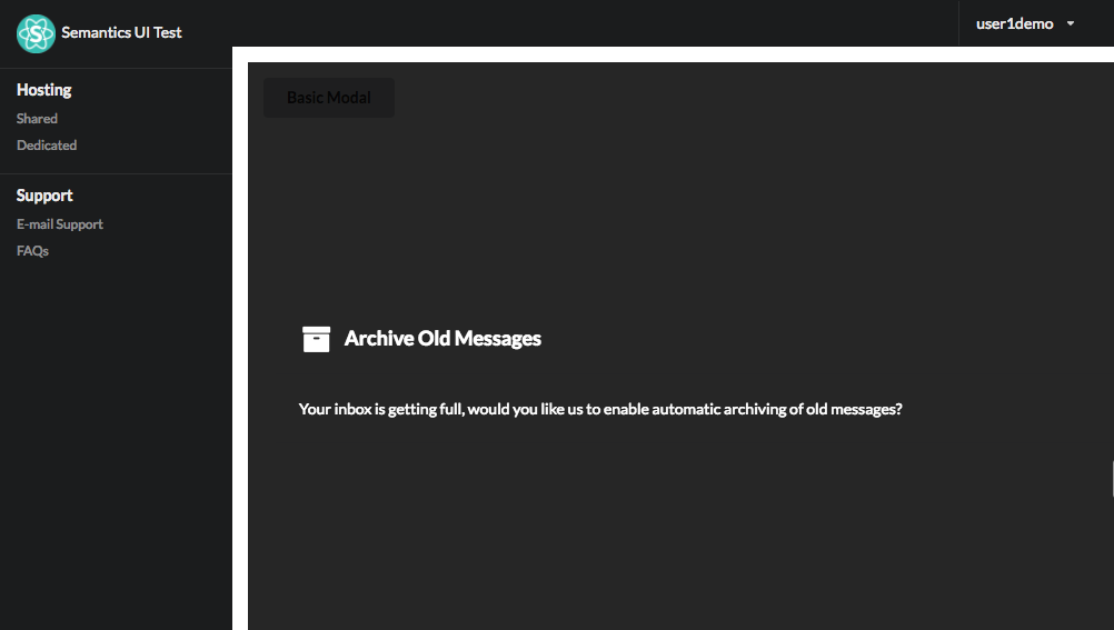

Thanks to Saad's comment mentioning the className that I found out that it was due to Semantic UI will add a
ui page modals dimmer transition visible activeclassName when the modal is opened. This causes a conflict to my existingpageclassName which is used in other pages, but because of Meteor and React, the various scss are compressed together.