I'm wondering how to render responsive pages using PhantomJS in pdf format. I have tried so many responsive pages and found that it is printing the pdf using the print css. So, if the page includes the print css OR screen only css it will render the pdf same as we found via print command preview (Ctrl + p).
Is there any way OR script by which i can get the pdf as I'm seeing them on web browser?
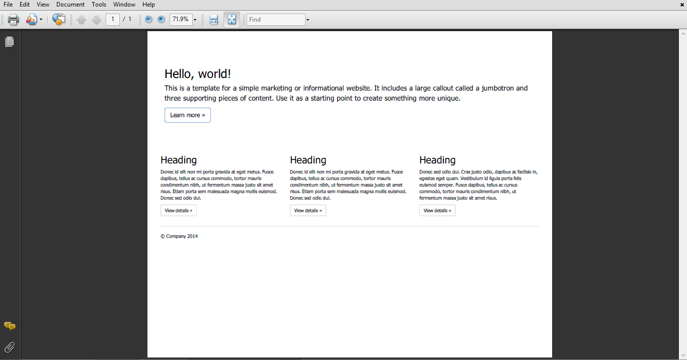
Attaching the file when i tried to get the pdf from http://getbootstrap.com/examples/jumbotron/.
Also the main issue is not responsive designes, the issue is print css applied over them.

This is quite tricky since there is no option to tell PhantomJS to use the
screenwhen rendering as PDF.You would need to
__utils__.sendAJAX,@media printblock (this is quite hard with regex because you need to look out for balanced braces, but relatively easy with plain JS),@media screento@media print,styleelement which has the manipulated stylesheet inside (preferable in the same place as the previous stylesheet) to the DOM.Your page won't look good, because you usually have page breaks and the like with pdf. Also, page width and viewport width are quite hard to get right. Changing the page width doesn't change the viewport, so it won't be the proper responsive that would have with a pixel perfect png. But that is only a solution if you don't need selectable text.