I want to change the Foreground (font color) of the mouse-over-day:

I've oriented myself on the following stackoverflow-question How Change datepicker's Selected Date Text Color (White) and also on the general calendar-style (github) of the mahapps-metro framework.
I not very good at styles and it took me a whole day to get the following output:
It changed the font color of the mouse-over day, nice! But the style for Background and selected cell is gone :(
<DatePicker
   x:Name="dtpEnddate">
     <DatePicker.Resources>
         <Color
            x:Key="NewColor">Pink</Color>
     </DatePicker.Resources>
     <DatePicker.CalendarStyle>
         <Style
             BasedOn="{StaticResource MahApps.Metro.Styles.BaseMetroCalendar}"
             TargetType="Calendar">
             <Setter
                 Property="CalendarDayButtonStyle">
                 <Setter.Value>
                     <Style
                         BasedOn="{StaticResource MahApps.Metro.Styles.MetroCalendarDayButtonStyle}"
                         TargetType="{x:Type CalendarDayButton}">
                         <Setter
                             Property="Template">
                             <Setter.Value>
                                 <ControlTemplate
                                     TargetType="{x:Type CalendarDayButton}">
                                     <Grid>
                                         <VisualStateManager.VisualStateGroups>
                                             <VisualStateGroup
                                                 x:Name="CommonStates">
                                                 <VisualStateGroup.Transitions>
                                                     <VisualTransition
                                                         GeneratedDuration="0:0:0.1" />
                                                 </VisualStateGroup.Transitions>
                                                 <VisualState
                                                     x:Name="Normal" />
                                                 <VisualState
                                                     x:Name="MouseOver">
                                                     <Storyboard>
                                                         <DoubleAnimation
                                                             Storyboard.TargetName="HighlightBackground"
                                                             Storyboard.TargetProperty="Opacity"
                                                             To="0.75"
                                                             Duration="0" />
                                                         <ColorAnimation
                                                             Duration="0"
                                                             To="{StaticResource NewColor}"
                                                             Storyboard.TargetProperty="(TextElement.Foreground).(SolidColorBrush.Color)"
                                                             Storyboard.TargetName="NormalText" />
                                                     </Storyboard>
                                                 </VisualState>

                                                 <VisualState
                                                     x:Name="Pressed">
                                                     <Storyboard>
                                                         <DoubleAnimation
                                                             Storyboard.TargetName="HighlightBackground"
                                                             Storyboard.TargetProperty="Opacity"
                                                             To="0.9"
                                                             Duration="0" />
                                                     </Storyboard>
                                                 </VisualState>
                                                 <VisualState
                                                     x:Name="Disabled">
                                                     <Storyboard>
                                                         <DoubleAnimation
                                                             Storyboard.TargetName="HighlightBackground"
                                                             Storyboard.TargetProperty="Opacity"
                                                             To="0"
                                                             Duration="0" />
                                                         <DoubleAnimation
                                                             Storyboard.TargetName="NormalText"
                                                             Storyboard.TargetProperty="Opacity"
                                                             To=".35"
                                                             Duration="0" />
                                                     </Storyboard>
                                                 </VisualState>
                                             </VisualStateGroup>
                                         </VisualStateManager.VisualStateGroups>
                                         <ContentPresenter
                                             x:Name="NormalText"
                                             TextElement.Foreground="#000000"
                                             Margin="{TemplateBinding Padding}"
                                             HorizontalAlignment="{TemplateBinding HorizontalContentAlignment}"
                                             VerticalAlignment="{TemplateBinding VerticalContentAlignment}" />
                                         <Rectangle
                                             x:Name="HighlightBackground"
                                             Fill="{DynamicResource MahApps.Brushes.Accent4}"
                                             Opacity="0" />
                                     </Grid>
                                 </ControlTemplate>
                             </Setter.Value>
                         </Setter>
                     </Style>
                 </Setter.Value>
             </Setter>
         </Style>
     </DatePicker.CalendarStyle>
I tried to copy the complete code inside of the original source from <Style x:Key="MahApps.Styles.CalendarDayButton" TargetType="{x:Type CalendarDayButton}"> with the additional ColorAnimation inside of the MouseOver-VisualState, but it ended up in the same result without background and selected cell.
Do you have any tips how to change the font color of the day on mouse-over? I would prefer to create a new style-snippet based on the frameworks style, not to recreate the whole style.
Here is some additional code from my App.xaml. I don't know if this is the reason:
    <Color
    x:Key="AccentColor">#9e0000</Color>
<Color
    x:Key="AccentColor2">#9e0000
</Color>
<Color
    x:Key="AccentColor3">#9e0000
</Color>
<Color
    x:Key="AccentColor4">#9e0000
</Color>
<Color
    x:Key="AccentColorWhite">#FFFFFF</Color>

<SolidColorBrush
    x:Key="lightGray"
    Color="LightGray"></SolidColorBrush>
<SolidColorBrush
    x:Key="HighlightBrush"
    Color="{StaticResource HighlightColor}" />
<SolidColorBrush
    x:Key="AccentBaseColorBrush"
    Color="{StaticResource AccentBaseColor}" />
<SolidColorBrush
    x:Key="AccentColorBrush"
    Color="{StaticResource AccentColor}" />
<SolidColorBrush
    x:Key="AccentColorBrush2"
    Color="{StaticResource AccentColor2}" />
<SolidColorBrush
    x:Key="AccentColorBrush3"
    Color="{StaticResource AccentColor3}" />
<SolidColorBrush
    x:Key="AccentColorBrush4"
    Color="{StaticResource AccentColor4}" />
<SolidColorBrush
    x:Key="WindowTitleColorBrush"
    Color="{StaticResource AccentColor}" />

<Color
    x:Key="IdealForegroundColor">White</Color>
<SolidColorBrush
    x:Key="IdealForegroundColorBrush"
    Color="{StaticResource IdealForegroundColor}" />
<SolidColorBrush
    x:Key="IdealForegroundDisabledBrush"
    Opacity="0.4"
    Color="{StaticResource IdealForegroundColor}" />
<SolidColorBrush
    x:Key="AccentSelectedColorBrush"
    Color="{StaticResource IdealForegroundColor}" />

<ResourceDictionary.MergedDictionaries>
        <ResourceDictionary
            Source="pack://application:,,,/MahApps.Metro;component/Styles/Controls.xaml" />

        <!-- Flat slider -->
        <ResourceDictionary
            Source="pack://application:,,,/MahApps.Metro;component/Styles/FlatSlider.xaml" />
        <ResourceDictionary
            Source="pack://application:,,,/MahApps.Metro;component/Styles/Fonts.xaml" />
        <ResourceDictionary
            Source="pack://application:,,,/MahApps.Metro;component/Styles/Colors.xaml" />
        <!-- Accent and AppTheme setting -->
        <ResourceDictionary
            Source="pack://application:,,,/MahApps.Metro;component/Styles/Controls.AnimatedTabControl.xaml" />
        <ResourceDictionary
            Source="pack://application:,,,/MahApps.Metro;component/Styles/Accents/Red.xaml" />
        <ResourceDictionary
            Source="pack://application:,,,/MahApps.Metro;component/Styles/Accents/BaseLight.xaml" />

</ResourceDictionary.MergedDictionaries>

Original Solution for Version 2.4.9
Unfortunately, if you need to adapt any part of control templates like visual states, you have to rewrite or copy it completely and adapt the parts in question. Styles can be based on others, but control templates cannot. However, as you already found out, you only have to adapt the calendar button style, not all styles for calendar.
Your style seems to be heavily edited and compared to the base style, there is a lot missing, which causes the missing visual representation. If you want to change the mouse over foreground color, you only have to add a
Triggerto the control template triggers, that observes ifIsMouseOverisTrue. Then you can set theForegroundbrush to yourNewBrush(I renamed it to brush).In this case, change your resource to a brush instead of a color (
Foregroundis of typeBrush).This is the whole
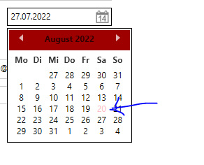
DatePickerwith the copied and adapted style for the calendar day buttons.This is what the result looks like for Red theme (might not be yours).
Update for Version 1.6.5
As you mentioned later in the comments, you are using MahApps.Metro version 1.6.5. Styles and templates change over time. The old version is incompatible with the current version.
Here is an adapted style based on the default style of the correct version.