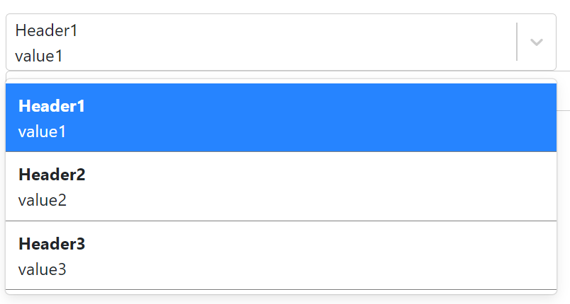
I needed a dropdown with multiple rows of text like this:
I used react-select with custom components:
import Select from 'react-select';
import DropDownOptions from './DropDownOptions';
import DropDownValueContainer from './DropDownValueContainer';

<Select
placeholder="Select Value"
options={options}
defaultValue={options[0]}
onChange={handleChange}
components={
    {
        Option: DropDownOptions,
        ValueContainer: DropDownValueContainer
    }
}
isSearchable={true}
/>
DropDownValueContainer
import React from "react";
import { components } from "react-select";

const DropDownValueContainer = ({ children, ...props }) => {
  return (
    <components.ValueContainer {...props}>
      <div>
        <div>{props.selectProps.value.label}</div>
        <div>{props.selectProps.value.value}</div>
        //There could be more html in here
      </div>
    </components.ValueContainer>
  );
};

export default DropDownValueContainer;
Issue 1: This is causing a problem with tab-accessibility. The Select is not accessible with tab key anymore.
Issue 2: The Select is not searchable anymore.
If I remove the custom ValueContainer, then above two issues do not occur. I have already used this implementation in my project but I need to make it accessible.
Generated HTML code using custom component:
<div class=" css-1s2u09g-control">
    <div class=" css-319lph-ValueContainer">
        <div class=" css-qc6sy-singleValue">Header1</div>
        <div class=" css-6j8wv5-Input" data-value="">
            <input class="" autocapitalize="none" autocomplete="off" autocorrect="off" id="react-select-3-input" spellcheck="false"
            tabindex="0" type="text" aria-autocomplete="list" aria-expanded="false" aria-haspopup="true" aria-controls="react-select-3-listbox"
            aria-owns="react-select-3-listbox" role="combobox" value=""
            style="color: inherit; background: 0px center; opacity: 1; width: 100%; grid-area: 1 / 2 / auto / auto; font: inherit; min-width: 2px; border: 0px; margin: 0px; outline: 0px; padding: 0px;"/>
        </div>
    </div>
Generated HTML code without custom component:
<div class=" css-1s2u09g-control">
    <div class=" css-319lph-ValueContainer">
        <div>
            <div>Header1</div>
            <div>value1</div>
        </div>
    </div>
Please help me understand what am I missing to make the input field work. Thanks.