PullRefreshIndicator overlaps with ScrollableTabRow

2.8k Views Asked by At

I'm starting to learn about Jetpack Compose. I put together this app where I explore different day-to-day use cases, each of the feature modules within this project is supposed to tackle different scenarios.

One of this feature modules – the chatexample feature module, tries to implement a simple ViewPager where each of the pages is a Fragment, the first page "Messages" is supposed to display a paginated RecyclerView wrapped around a SwipeRefreshLayout. Now, the goal is to implement all this using Jetpack Compose. This is the issue I'm having right now:

enter image description here

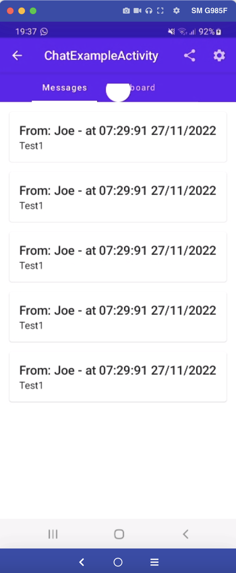
The PullRefreshIndicator that I'm using to implement the Pull-To-Refresh action works as expected and everything seems pretty straightforward so far, but I cannot figure out why the ProgresBar stays there on top.

So far I've tried; Carrying on the Modifier from the parent Scaffold all the way through. Making sure I explicitly set the sizes to fit the max height and width. Add an empty Box in the when statement - but nothing has worked so far, I'm guessing I could just remove the PullRefreshIndicator if I see that the ViewModel isn't supposed to be refreshing, but I don't think that's the right thing to do.

To quickly explain the Composables that I'm using here I have:

<Surface>
   <Scaffold> // Set with a topBar
       <Column>
           <ScrollableTabRow>
              <Tab/> // Set for the first "Messages" tab
              <Tab/> // Set for the second "Dashboard" tab
           </ScrollableTabRow>
           <HorizontalPager>
                // ChatExampleScreen
                <Box> // A Box set with the pullRefresh modifier
                   // Depending on the ChatExamleViewModel we might pull different composables here
                   </PullRefreshIndicator>
                </Box>
                // Another ChatExampleScreen for the second tab
           </HorizontalPager>
       </Column>
   <Scaffold> 
</Surface>

Honestly, I don't get how the PullRefreshIndicator that is in a completely different Composable (ChatExampleScreen) gets to overlap with the ScrollableTabRow that is outside.

Hope this makes digesting the UI a bit easier. Any tip, advice, or recommendation is appreciated. Thanks!

Edit: Just to be completely clear, what I'm trying to achieve here is to have a PullRefreshIndicator on each page. Something like this:

enter image description here

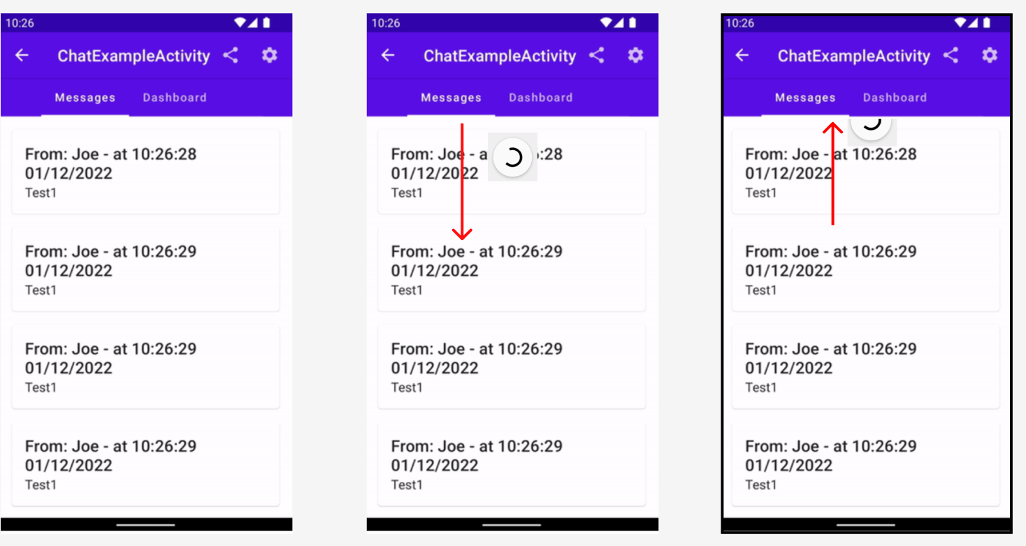
On each page, you pull down, see the ProgressBar appear, and when it is done, it goes away, within the same page. Not overlapping with the tabs above.

6

There are 6 best solutions below

1
On BEST ANSWER

There is yet another solution to this problem, which is using a .clipToBounds() modifier over the tab content container.

3
On

A comparatively easier solution in my case was to simply give the Box that contains my vertically scrollable Composable and my PullRefreshIndicator a zIndex of -1f:

Box(Modifier.fillMaxSize().zIndex(-1f)) {
    LazyColumn(...)
    PullRefreshIndicator(...)
}

And that already did the trick for me. I have a very similar setup to the OP, a Scaffold containing a ScrollableTabRow and a HorizontalPager with refreshable lists on the individual tabs.

3
On

I think there's nothing wrong with the PullRefresh api and the Compose/Accompanist Tab/Pager api being used together, it seems like the PullRefresh is just respecting the placement structure of the layout/container it is put into.

Consider this code, no tabs, no pager, just a simple set-up of widgets that is identical to your set-up

Column(
        modifier = Modifier.padding(it)
    ) {

        Box(
            modifier = Modifier
                .fillMaxWidth()
                .height(80.dp)
                .background(Color.Blue)
        )

        val pullRefreshState = rememberPullRefreshState(
            refreshing = false,
            onRefresh = { viewModel.fetchMessages() }
        )

        Box(
            modifier = Modifier.pullRefresh(pullRefreshState)
        ) {

            PullRefreshIndicator(
                modifier = Modifier.align(Alignment.TopCenter),
                refreshing = false,
                state = pullRefreshState,
            )
        }
    }

What it looks like.

enter image description here

The PullRefresh is placed inside a component(Box) that is placed below another component in a Column vertical placement, and since it's below another widget, its initial position will not be hidden like the image sample.

With your set-up, since I noticed that the ViewModel is being shared by the tabs and also the reason why I was confirming if you are decided with your architecture is because the only fix I can think of is moving the PullRefresh up in the sequence of the composable widgets.

First changes I made is in your ChatExampleScreen composable, which ended up like this, all PullRefresh components are removed.

@Composable
fun ChatExampleScreen(
    chatexampleViewModel: ChatExampleViewModel,
    modifier: Modifier = Modifier
) {
    val chatexampleViewModelState by chatexampleViewModel.state.observeAsState()

    Box(
        modifier = modifier
            .fillMaxSize()
    ) {

        when (val result = chatexampleViewModelState) {
            is ChatExampleViewModel.State.SuccessfullyLoadedMessages -> {
                ChatExampleScreenSuccessfullyLoadedMessages(
                    chatexampleMessages = result.list,
                    modifier = modifier,
                )
            }
            is ChatExampleViewModel.State.NoMessagesFetched -> {
                ChatExampleScreenEmptyState(
                    modifier = modifier
                )
            }
            is ChatExampleViewModel.State.NoInternetConnectivity -> {
                NoInternetConnectivityScreen(
                    modifier = modifier
                )
            }
            else -> {
                // Agus - Do nothing???
                Box(modifier = modifier.fillMaxSize())
            }
        }
    }
}

and in your Activity I moved all the setContent{…} scope into another function named ChatTabsContent and placed everything inside it including the PullRefresh components.

@OptIn(ExperimentalMaterialApi::class)
@Composable
fun ChatTabsContent(
    modifier : Modifier = Modifier,
    viewModel : ChatExampleViewModel
) {
    val chatexampleViewModelIsLoadingState by viewModel.isLoading.observeAsState()

    val pullRefreshState = rememberPullRefreshState(
        refreshing = chatexampleViewModelIsLoadingState == true,
        onRefresh = { viewModel.fetchMessages() }
    )

    Box(
        modifier = modifier
            .pullRefresh(pullRefreshState)
    ) {

        Column(
            Modifier
                .fillMaxSize()
        ) {
            val pagerState = rememberPagerState()

            ScrollableTabRow(
                selectedTabIndex = pagerState.currentPage,
                indicator = { tabPositions ->
                    TabRowDefaults.Indicator(
                        modifier = Modifier.tabIndicatorOffset(
                            currentTabPosition = tabPositions[pagerState.currentPage],
                        )
                    )
                }
            ) {
                Tab(
                    selected = pagerState.currentPage == 0,
                    onClick = { },
                    text = {
                        Text(
                            text = "Messages"
                        )
                    }
                )
                Tab(
                    selected = pagerState.currentPage == 1,
                    onClick = { },
                    text = {
                        Text(
                            text = "Dashboard"
                        )
                    }
                )
            }

            HorizontalPager(
                count = 2,
                state = pagerState,
                modifier = Modifier.fillMaxWidth(),
            ) { page ->
                when (page) {
                    0 -> {
                        ChatExampleScreen(
                            chatexampleViewModel = viewModel,
                            modifier = Modifier.fillMaxSize()
                        )
                    }
                    1 -> {
                        ChatExampleScreen(
                            chatexampleViewModel = viewModel,
                            modifier = Modifier.fillMaxWidth()
                        )
                    }
                }
            }
        }

        PullRefreshIndicator(
            modifier = Modifier.align(Alignment.TopCenter),
            refreshing = chatexampleViewModelIsLoadingState == true,
            state = pullRefreshState,
        )
    }
}

which ended up like this

 setContent {
        TheOneAppTheme {
            // A surface container using the 'background' color from the theme
            Surface(
                modifier = Modifier.fillMaxSize(),
                color = MaterialTheme.colors.background
            ) {
                Scaffold(
                    modifier = Modifier.fillMaxSize(),
                    topBar = { TopAppBarSample() }
                ) {

                    ChatTabsContent(
                        modifier = Modifier.padding(it),
                        viewModel = viewModel
                    )
                }
            }
        }
    }

Result:

enter image description here

Structural changes.

<Surface>
    <Scaffold> // Set with a topBar
        <Box>
            <Column>
                <ScrollableTabRow>
                    <Tab/> // Set for the first "Messages" tab
                    <Tab/> // Set for the second "Dashboard" tab
                </ScrollableTabRow>
                <HorizontalPager>
                    <Box/>
                </HorizontalPager>
            </Column>

            // pull refresh is now at the most "z" index of the 
            // box, overlapping the content (tabs/pager)
            <PullRefreshIndicator/> 
        </Box>
    <Scaffold>
</Surface>

I haven't explored this API yet, but it looks like it should be used directly in a z-oriented layout/container parent such as Box as the last child.

0
On

I just want to share more details about the issue here and what the solution is. I appreciate a lot the solutions shared above and these were definitely key to figuring the problem out.

The bare-minimum solution here is to replace the Box with a ConstraintLayout in the ChatScreenExample composable:

enter image description here

Why? Because as @z.y shared above the PullRefreshIndicator needs to be contained on a "vertically scrollable" composable, and while the Box composable can be set with the vericalScroll() modifier we need to make sure we constraint the height of the content, that's why we had to change to a ConstraintLayout.

Feel free to correct me if I'm missing something.

6
On

I want to leave my first answer as I feel it will still be useful to future readers, so heres another one you might consider.

One of the Box in the tabs has a scroll modifier though, because according to the Accompanist Docs and the actual functionality.

… The content needs to be 'vertically scrollable' for SwipeRefresh() to be able to react to swipe gestures. Layouts such as LazyColumn are automatically vertically scrollable, but others such as Column or LazyRow are not. In those instances, you can provide a Modifier.verticalScroll modifier…

It's from accompanist documentation about the migration of the API but it still applies to this current one in compose framework.

The way I understand it is a scroll event should be present for the PullRefresh to get activated manually (i.e a layout/container with a vertical scroll modifier or a LazyColumn), something that will consume a drag/swipe event in the screen.

Here's the short working sample. All of these are copy-and-paste-able.

Activity:

class PullRefreshActivity: ComponentActivity() {

    private val viewModel: MyViewModel by viewModels()

    override fun onCreate(savedInstanceState: Bundle?) {
        super.onCreate(savedInstanceState)
        setContent {
            MyAppTheme {
                Surface(
                    modifier = Modifier.fillMaxSize(),
                    color = MaterialTheme.colors.background
                ) {
                    Scaffold(
                        modifier = Modifier.fillMaxSize(),
                        topBar = { TopAppBarSample() }
                    ) {
                        MyScreen(
                            modifier = Modifier.padding(it),
                            viewModel = viewModel
                        )
                    }
                }
            }
        }
    }
}

Some data classes:

data class MessageItems(
    val message: String = "",
    val author: String = ""
)

data class DashboardBanner(
    val bannerMessage: String = "",
    val content: String = ""
)

ViewModel:

class MyViewModel: ViewModel() {

    var isLoading by mutableStateOf(false)

    private val _messageState = MutableStateFlow(mutableStateListOf<MessageItems>())
    val messageState = _messageState.asStateFlow()

    private val _dashboardState = MutableStateFlow(DashboardBanner())
    val dashboardState = _dashboardState.asStateFlow()

    fun fetchMessages() {

        viewModelScope.launch {
            isLoading = true

            delay(2000L)

            _messageState.update {
                it.add(
                    MessageItems(
                        message = "Hello First Message",
                        author = "Author 1"
                    ),
                )
                it.add(
                    MessageItems(
                        message = "Hello Second Message",
                        author = "Author 2"
                    )
                )

                it
            }
            isLoading = false
        }
    }

    fun fetchDashboard() {

        viewModelScope.launch {
            isLoading = true

            delay(2000L)

            _dashboardState.update {
                it.copy(
                    bannerMessage = "Hello World!!",
                    content = "Welcome to Pull Refresh Content!"
                )
            }
            isLoading = false
        }
    }
}

Tab Screen Composables:

@Composable
fun MessageTab(
    myViewModel : MyViewModel
) {
    val messages by myViewModel.messageState.collectAsState()

    LazyColumn(
        modifier = Modifier.fillMaxSize()
    ) {
        items(messages) { item ->
            Column(
                modifier = Modifier
                    .fillMaxWidth()
                    .border(BorderStroke(Dp.Hairline, Color.DarkGray)),
                horizontalAlignment = Alignment.CenterHorizontally
            ) {
                Text(text = item.message)
                Text(text = item.author)
            }
        }
    }
}

@Composable
fun DashboardTab(
    myViewModel: MyViewModel
) {

    val banner by myViewModel.dashboardState.collectAsState()

    Box(
        modifier = Modifier
            .fillMaxSize()
            .verticalScroll(rememberScrollState()),
        contentAlignment = Alignment.Center
    ) {
        Column {
            Text(
                text = banner.bannerMessage,
                fontSize = 52.sp
            )

            Text(
                text = banner.content,
                fontSize = 16.sp
            )
        }
    }
}

Finally, the composable that contains the PullRefresh and the Pager/Tab components, and all of them are direct children of a ConstraintLayout. So to achieve a PullRefresh behind the Tabs but still on top of the HorizontalPager, first I had to put the HorizontalPager as the first child, the PullRefresh as the second and the Tabs as the last one, constraining them accordingly to preserve the visual arrangement of a Tab Pager.

@OptIn(ExperimentalMaterialApi::class, ExperimentalPagerApi::class)
@Composable
fun MyScreen(
    modifier : Modifier = Modifier,
    viewModel: MyViewModel
) {
    val refreshing = viewModel.isLoading
    val pagerState = rememberPagerState()

    val pullRefreshState = rememberPullRefreshState(
        refreshing = refreshing,
        onRefresh = {
            when (pagerState.currentPage) {
                0 -> {
                    viewModel.fetchMessages()
                }
                1 -> {
                    viewModel.fetchDashboard()
                }
            }
        },
        refreshingOffset = 100.dp // just an arbitrary offset where the refresh will animate
    )

    ConstraintLayout(
        modifier = modifier
            .fillMaxSize()
            .pullRefresh(pullRefreshState)
    ) {
        val (pager, pullRefresh, tabs) = createRefs()

        HorizontalPager(
            count = 2,
            state = pagerState,
            modifier = Modifier.constrainAs(pager) {
                top.linkTo(tabs.bottom)
                start.linkTo(parent.start)
                end.linkTo(parent.end)
                bottom.linkTo(parent.bottom)
                height = Dimension.fillToConstraints
            }
        ) { page ->
            when (page) {
                0 -> {
                    MessageTab(
                        myViewModel = viewModel
                    )
                }
                1 -> {
                    DashboardTab(
                        myViewModel = viewModel
                    )
                }
            }
        }

        PullRefreshIndicator(
            modifier = Modifier.constrainAs(pullRefresh) {
                top.linkTo(parent.top)
                start.linkTo(parent.start)
                end.linkTo(parent.end)
            },
            refreshing = refreshing,
            state = pullRefreshState,
        )

        ScrollableTabRow(
            modifier = Modifier.constrainAs(tabs) {
                top.linkTo(parent.top)
                start.linkTo(parent.start)
                end.linkTo(parent.end)
            },
            selectedTabIndex = pagerState.currentPage,
            indicator = { tabPositions ->
                TabRowDefaults.Indicator(
                    modifier = Modifier.tabIndicatorOffset(
                        currentTabPosition = tabPositions[pagerState.currentPage],
                    )
                )
            },
        ) {
            Tab(
                selected = pagerState.currentPage == 0,
                onClick = {},
                text = {
                    Text(
                        text = "Messages"
                    )
                }
            )

            Tab(
                selected = pagerState.currentPage == 1,
                onClick = {},
                text = {
                    Text(
                        text = "Dashboard"
                    )
                }
            )
        }
    }
}

output:

enter image description here

<Surface>
    <Scaffold>
        <ConstraintLayout>

            // top to ScrollableTabRow's bottom
            // start, end, bottom to parent's start, end and bottom
            // 0.dp (view), fillToConstraints (compose)
            <HorizontalPager>
                <PagerScreens/>
            </HorizontalPager>

            // top, start, end of parent
            <PullRefreshIndicator/>

            // top, start and end of parent
            <ScrollableTabRow>
                <Tab/> // Set for the first "Messages" tab
                <Tab/> // Set for the second "Dashboard" tab
            </ScrollableTabRow>
        </ConstraintLayout>
   <Scaffold>
</Surface>
1
On

No need of constraintLayout , just use Scaffold()