Reduce Spacing between Scrollable tabs in compose

1.7k Views Asked by At

I am trying to create a animation where there is scrollable component that scrolls horizontally. Something like

enter image description here

I thought of using Scrollable tabs and it works to some extent except, I am still figuring out how to reduce space between the crop items that you see in the above gif

What I have tried?

@Composable
fun CropBar(onCropClicked: (Int) -> Unit) {
    var selectedIndex by remember { mutableStateOf(0) }
    val pages = listOf("kotlin", "java", "c#", "php", "golang","A","B","C")
    val colors = listOf(Color.Yellow, Color.Red, Color.White, Color.Blue, Color.Magenta)

    val indicator = @Composable { tabPositions: List<TabPosition> ->
        val color = when (selectedIndex) {
            0 -> colors[0]
            1 -> colors[1]
            2 -> colors[2]
            3 -> colors[3]
            else -> colors[4]
        }
        CustomIndicator(tabPositions = tabPositions, selectedIndex = selectedIndex, color)
    }
    ScrollableTabRow(
        modifier = Modifier
            .fillMaxWidth()
            .height(58.dp),
        selectedTabIndex = selectedIndex,
        containerColor = Color(0xFF03753C),
        indicator = indicator,
        edgePadding = 0.dp,
        divider = {
        },

        ) {
        pages.forEachIndexed { index, title ->

            Tab(
                modifier = Modifier
                    .height(58.dp)
                    .width(74.dp)
                    .zIndex(2f),
                selected = selectedIndex == index,
                onClick = {
                    selectedIndex = index
                    onCropClicked(index)
                },
                interactionSource = NoRippleInteractionSource()
            ) {

                SampleImage(selectedIndex)
            }
        }
    }

}

@Composable
private fun CustomIndicator(tabPositions: List<TabPosition>, selectedIndex: Int, color: Color) {

    val transition = updateTransition(selectedIndex, label = "transition")

    val indicatorStart by transition.animateDp(
        transitionSpec = {
            tween(
                durationMillis = 500,
                easing = LinearOutSlowInEasing
            )
        },
        label = ""
    ) {
        tabPositions[it].left
    }

    val indicatorEnd by transition.animateDp(
        transitionSpec = {
            tween(
                durationMillis = 500,
                easing = LinearOutSlowInEasing
            )
        },
        label = "",
    ) {
        tabPositions[it].right
    }
    Box(
        Modifier
            .padding(top = 8.dp)
            .offset(x = indicatorStart)
            .wrapContentSize(align = Alignment.BottomStart)
            .width(indicatorEnd - indicatorStart)
            .paint(
                // Replace with your image id
                painterResource(id = R.drawable.ic_test), // some background vector drawable image
                contentScale = ContentScale.FillWidth,
                colorFilter = ColorFilter.tint(color) // for tinting
            )
            .zIndex(1f)
    )
}

@Composable
fun SampleImage(selectedIndex: Int) {

    BoxWithConstraints(
        modifier = Modifier,
    ) {
        Image(
            modifier = Modifier
                .padding(top = 8.dp)
                .width(42.dp)
                .height(42.dp)
                .align(Alignment.BottomCenter),
            painter = painterResource(id = R.drawable.ic_img_round),
            contentDescription = "Image"
        )

        if(selectedIndex == 1) {
            Text(
                text = "180 Days",
                fontSize = 8.sp,
                modifier = Modifier
                    .align(Alignment.BottomCenter)
                    .padding(top = 18.dp)
                    .width(42.dp)
                    .clip(RoundedCornerShape(10.dp))
                    .background(Color.Gray)
                    .graphicsLayer {
                        translationX = 5f
                    }
            )
        }
    }
}

class NoRippleInteractionSource : MutableInteractionSource {
    override val interactions: Flow<Interaction> = emptyFlow()
    override suspend fun emit(interaction: Interaction) {}
    override fun tryEmit(interaction: Interaction) = true
}

Result : The code is just a rough sample.

enter image description here

Desired Result : I should be able to control the spacing between tab items. I am not looking for solution using only scrollable tabs. In fact any scrollable component with selected item having a background and transitioning the background to new selected item is okay. I thought of using something like Row with a drawBehind of Image at a offset and then get the clicked item position and move the background to selected Items. Any other solution or ideas?

Just in case it helps : https://issuetracker.google.com/issues/234942462

Note: I check with uiautomaterviewer the plantix app. They use a a custom horizontall scrollview and they use a framelayout. The curves are custom path using cubic bezier curve. I guess the calculate offset of clicked crop or bounds and then move the background view to and from a certain offset.

2

There are 2 best solutions below

2
On BEST ANSWER

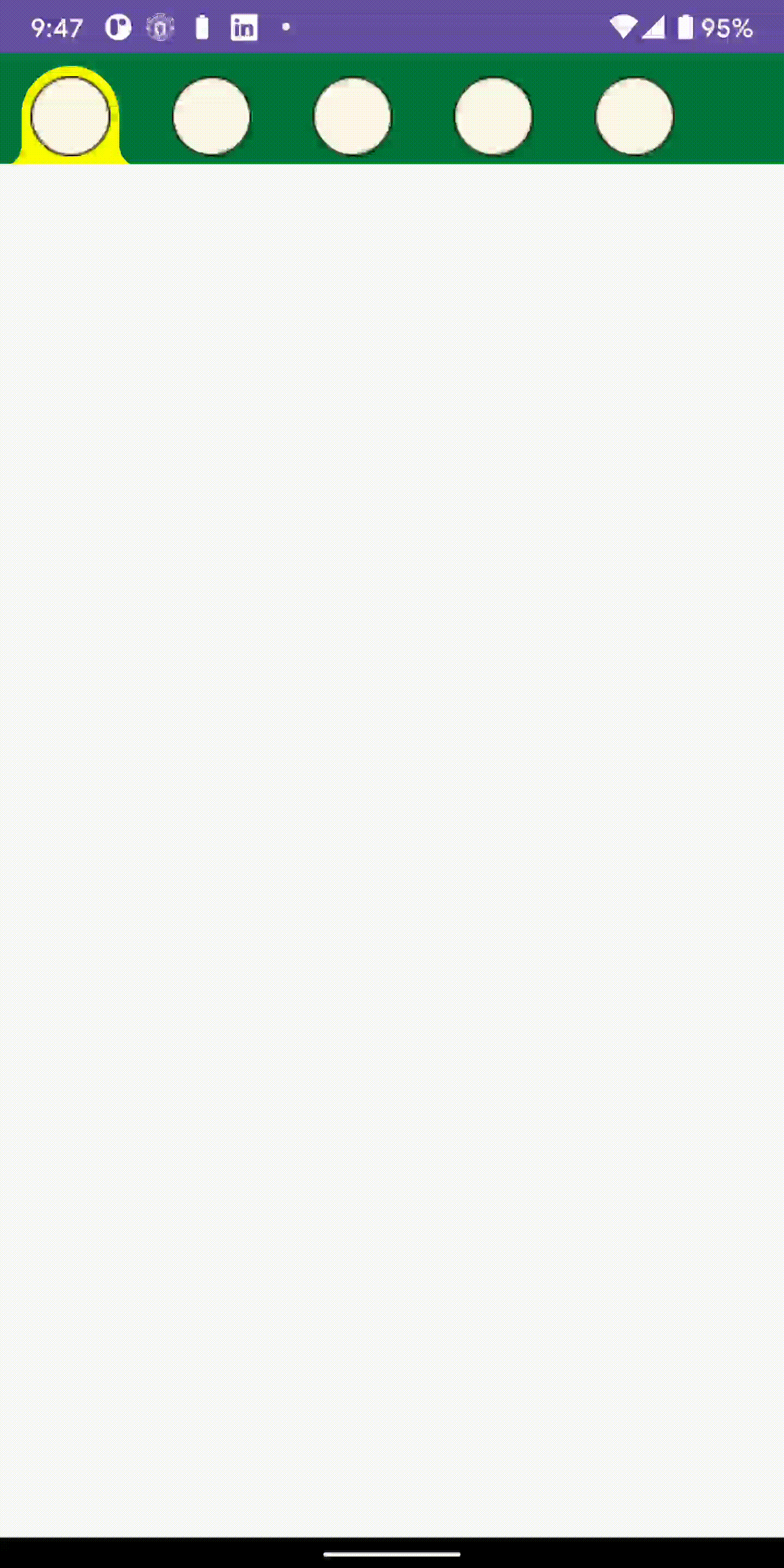
Unfortunately, minumum width tabs are measured with is a fixed value

private val ScrollableTabRowMinimumTabWidth = 90.dp

but this can be updated by copy pasting ScrollableTabRow source code and changing this or not using a Constraints with minimum width.

The one on top is with default width and for the one at the bottom i changed minimum width a Measurable can be measured to 0.dp

which means it can be measured with any value between 0-and max

Result

enter image description here

Demo

@Preview
@Composable
private fun Test() {
    CropBar() {

    }
}

@Composable
fun CropBar(onCropClicked: (Int) -> Unit) {
    Column {

        Spacer(modifier = Modifier.height(20.dp))
        var selectedIndex by remember { mutableStateOf(0) }
        val pages = listOf("kotlin", "java", "c#", "php", "golang", "A", "B", "C")
        val colors = listOf(Color.Yellow, Color.Red, Color.White, Color.Blue, Color.Magenta)

        val indicator = @Composable { tabPositions: List<TabPosition> ->
            val color = when (selectedIndex) {
                0 -> colors[0]
                1 -> colors[1]
                2 -> colors[2]
                3 -> colors[3]
                else -> colors[4]
            }
            CustomIndicator(tabPositions = tabPositions, selectedIndex = selectedIndex, color)
        }
        MyScrollableTabRow(
            modifier = Modifier
                .fillMaxWidth()
                .height(58.dp),
            selectedTabIndex = selectedIndex,
            backgroundColor = Color(0xFF03753C),
            indicator = indicator,
            edgePadding = 0.dp,
            divider = {
            },

            ) {
            pages.forEachIndexed { index, title ->

                Tab(
                    modifier = Modifier
                        .height(58.dp)
                        .width(74.dp)
                        .zIndex(2f),
                    selected = selectedIndex == index,
                    onClick = {
                        selectedIndex = index
                        onCropClicked(index)
                    },
                    interactionSource = NoRippleInteractionSource()
                ) {

                    SampleImage(selectedIndex)
                }
            }
        }

        Spacer(modifier = Modifier.height(20.dp))

        MyScrollableTabRow(
            modifier = Modifier
                .fillMaxWidth()
                .height(58.dp),
            selectedTabIndex = selectedIndex,
            backgroundColor = Color(0xFF03753C),
            indicator = indicator,
            minItemWidth = 0.dp,
            edgePadding = 0.dp,
            divider = {
            },

            ) {
            pages.forEachIndexed { index, title ->

                Tab(
                    modifier = Modifier
                        .height(58.dp)
                        .width(74.dp)
                        .zIndex(2f),
                    selected = selectedIndex == index,
                    onClick = {
                        selectedIndex = index
                        onCropClicked(index)
                    },
                    interactionSource = NoRippleInteractionSource()
                ) {

                    SampleImage(selectedIndex)
                }
            }
        }
    }
}

Implementation

@Composable
@UiComposable
fun MyScrollableTabRow(
    selectedTabIndex: Int,
    modifier: Modifier = Modifier,
    minItemWidth:Dp =ScrollableTabRowMinimumTabWidth,
    backgroundColor: Color = MaterialTheme.colors.primarySurface,
    contentColor: Color = contentColorFor(backgroundColor),
    edgePadding: Dp = TabRowDefaults.ScrollableTabRowPadding,
    indicator: @Composable @UiComposable
        (tabPositions: List<TabPosition>) -> Unit = @Composable { tabPositions ->
        TabRowDefaults.Indicator(
            Modifier.tabIndicatorOffset(tabPositions[selectedTabIndex])
        )
    },
    divider: @Composable @UiComposable () -> Unit =
        @Composable {
            TabRowDefaults.Divider()
        },
    tabs: @Composable @UiComposable () -> Unit
) {
    Surface(
        modifier = modifier,
        color = backgroundColor,
        contentColor = contentColor
    ) {
        val scrollState = rememberScrollState()
        val coroutineScope = rememberCoroutineScope()
        val scrollableTabData = remember(scrollState, coroutineScope) {
            ScrollableTabData(
                scrollState = scrollState,
                coroutineScope = coroutineScope
            )
        }
        SubcomposeLayout(
            Modifier.fillMaxWidth()
                .wrapContentSize(align = Alignment.CenterStart)
                .horizontalScroll(scrollState)
                .selectableGroup()
                .clipToBounds()
        ) { constraints ->

            //  Change this to 0 or
            val minTabWidth = minItemWidth.roundToPx()
            val padding = edgePadding.roundToPx()
            // or use constraints to measure each tab with its own width or
            // a another value instead of them having at least 90.dp
            val tabConstraints = constraints.copy(minWidth = minTabWidth)

            val tabPlaceables = subcompose(com.smarttoolfactory.tutorial1_1basics.chapter6_graphics.TabSlots.Tabs, tabs)
                .map { it.measure(tabConstraints) }

            var layoutWidth = padding * 2
            var layoutHeight = 0
            tabPlaceables.forEach {
                layoutWidth += it.width
                layoutHeight = maxOf(layoutHeight, it.height)
            }

            // Position the children.
            layout(layoutWidth, layoutHeight) {
                // Place the tabs
                val tabPositions = mutableListOf<TabPosition>()
                var left = padding
                tabPlaceables.forEach {
                    it.placeRelative(left, 0)
                    tabPositions.add(TabPosition(left = left.toDp(), width = it.width.toDp()))
                    left += it.width
                }

                // The divider is measured with its own height, and width equal to the total width
                // of the tab row, and then placed on top of the tabs.
                subcompose(com.smarttoolfactory.tutorial1_1basics.chapter6_graphics.TabSlots.Divider, divider).forEach {
                    val placeable = it.measure(
                        constraints.copy(
                            minHeight = 0,
                            minWidth = layoutWidth,
                            maxWidth = layoutWidth
                        )
                    )
                    placeable.placeRelative(0, layoutHeight - placeable.height)
                }

                // The indicator container is measured to fill the entire space occupied by the tab
                // row, and then placed on top of the divider.
                subcompose(com.smarttoolfactory.tutorial1_1basics.chapter6_graphics.TabSlots.Indicator) {
                    indicator(tabPositions)
                }.forEach {
                    it.measure(Constraints.fixed(layoutWidth, layoutHeight)).placeRelative(0, 0)
                }

                scrollableTabData.onLaidOut(
                    density = this@SubcomposeLayout,
                    edgeOffset = padding,
                    tabPositions = tabPositions,
                    selectedTab = selectedTabIndex
                )
            }
        }
    }
}

@Immutable
class TabPosition internal constructor(val left: Dp, val width: Dp) {
    val right: Dp get() = left + width

    override fun equals(other: Any?): Boolean {
        if (this === other) return true
        if (other !is TabPosition) return false

        if (left != other.left) return false
        if (width != other.width) return false

        return true
    }

    override fun hashCode(): Int {
        var result = left.hashCode()
        result = 31 * result + width.hashCode()
        return result
    }

    override fun toString(): String {
        return "TabPosition(left=$left, right=$right, width=$width)"
    }
}

object TabRowDefaults {
    /**
     * Default [Divider], which will be positioned at the bottom of the [TabRow], underneath the
     * indicator.
     *
     * @param modifier modifier for the divider's layout
     * @param thickness thickness of the divider
     * @param color color of the divider
     */
    @Composable
    fun Divider(
        modifier: Modifier = Modifier,
        thickness: Dp = DividerThickness,
        color: Color = LocalContentColor.current.copy(alpha = DividerOpacity)
    ) {
        androidx.compose.material.Divider(modifier = modifier, thickness = thickness, color = color)
    }

    /**
     * Default indicator, which will be positioned at the bottom of the [TabRow], on top of the
     * divider.
     *
     * @param modifier modifier for the indicator's layout
     * @param height height of the indicator
     * @param color color of the indicator
     */
    @Composable
    fun Indicator(
        modifier: Modifier = Modifier,
        height: Dp = IndicatorHeight,
        color: Color = LocalContentColor.current
    ) {
        Box(
            modifier
                .fillMaxWidth()
                .height(height)
                .background(color = color)
        )
    }

    /**
     * [Modifier] that takes up all the available width inside the [TabRow], and then animates
     * the offset of the indicator it is applied to, depending on the [currentTabPosition].
     *
     * @param currentTabPosition [TabPosition] of the currently selected tab. This is used to
     * calculate the offset of the indicator this modifier is applied to, as well as its width.
     */
    fun Modifier.tabIndicatorOffset(
        currentTabPosition: TabPosition
    ): Modifier = composed(
        inspectorInfo = debugInspectorInfo {
            name = "tabIndicatorOffset"
            value = currentTabPosition
        }
    ) {
        val currentTabWidth by animateDpAsState(
            targetValue = currentTabPosition.width,
            animationSpec = tween(durationMillis = 250, easing = FastOutSlowInEasing)
        )
        val indicatorOffset by animateDpAsState(
            targetValue = currentTabPosition.left,
            animationSpec = tween(durationMillis = 250, easing = FastOutSlowInEasing)
        )
        fillMaxWidth()
            .wrapContentSize(Alignment.BottomStart)
            .offset(x = indicatorOffset)
            .width(currentTabWidth)
    }

    /**
     * Default opacity for the color of [Divider]
     */
    const val DividerOpacity = 0.12f

    /**
     * Default thickness for [Divider]
     */
    val DividerThickness = 1.dp

    /**
     * Default height for [Indicator]
     */
    val IndicatorHeight = 2.dp

    /**
     * The default padding from the starting edge before a tab in a [ScrollableTabRow].
     */
    val ScrollableTabRowPadding = 52.dp
}

private enum class TabSlots {
    Tabs,
    Divider,
    Indicator
}

/**
 * Class holding onto state needed for [ScrollableTabRow]
 */
private class ScrollableTabData(
    private val scrollState: ScrollState,
    private val coroutineScope: CoroutineScope
) {
    private var selectedTab: Int? = null

    fun onLaidOut(
        density: Density,
        edgeOffset: Int,
        tabPositions: List<TabPosition>,
        selectedTab: Int
    ) {
        // Animate if the new tab is different from the old tab, or this is called for the first
        // time (i.e selectedTab is `null`).
        if (this.selectedTab != selectedTab) {
            this.selectedTab = selectedTab
            tabPositions.getOrNull(selectedTab)?.let {
                // Scrolls to the tab with [tabPosition], trying to place it in the center of the
                // screen or as close to the center as possible.
                val calculatedOffset = it.calculateTabOffset(density, edgeOffset, tabPositions)
                if (scrollState.value != calculatedOffset) {
                    coroutineScope.launch {
                        scrollState.animateScrollTo(
                            calculatedOffset,
                            animationSpec = ScrollableTabRowScrollSpec
                        )
                    }
                }
            }
        }
    }

    /**
     * @return the offset required to horizontally center the tab inside this TabRow.
     * If the tab is at the start / end, and there is not enough space to fully centre the tab, this
     * will just clamp to the min / max position given the max width.
     */
    private fun TabPosition.calculateTabOffset(
        density: Density,
        edgeOffset: Int,
        tabPositions: List<TabPosition>
    ): Int = with(density) {
        val totalTabRowWidth = tabPositions.last().right.roundToPx() + edgeOffset
        val visibleWidth = totalTabRowWidth - scrollState.maxValue
        val tabOffset = left.roundToPx()
        val scrollerCenter = visibleWidth / 2
        val tabWidth = width.roundToPx()
        val centeredTabOffset = tabOffset - (scrollerCenter - tabWidth / 2)
        // How much space we have to scroll. If the visible width is <= to the total width, then
        // we have no space to scroll as everything is always visible.
        val availableSpace = (totalTabRowWidth - visibleWidth).coerceAtLeast(0)
        return centeredTabOffset.coerceIn(0, availableSpace)
    }
}

private val ScrollableTabRowMinimumTabWidth = 90.dp

/**
 * [AnimationSpec] used when scrolling to a tab that is not fully visible.
 */
private val ScrollableTabRowScrollSpec: AnimationSpec<Float> = tween(
    durationMillis = 250,
    easing = FastOutSlowInEasing
)
0
On

I was able to achieve this with setting a background to the row and animating the offset of the background.

The accepted answer works with tabs but using lazy row i can space the item with whatever padding i need. This is exactly how the plantix app works as shown in the gif of the question.

@Composable
fun EquiRow() {
val selectedIndex = remember { mutableStateOf(0) }
val colors = listOf(
    Color.Magenta,
    Color.Red,
    Color.Green,
    Color.Yellow,
    Color.Magenta,
    Color.Black,
    Color.Red
)

val first = remember {
    mutableStateOf(true)
}

val index = remember {
    mutableStateOf(4)
}

val scrollState = rememberScrollState()

val radius = with(LocalDensity.current) { 40.dp.toPx() }
val initialX = if (index.value == 0) {
    with(LocalDensity.current) { 27.dp.toPx() }
} else {
    with(LocalDensity.current) { ((index.value * 54.dp.toPx()) + (14.dp.toPx() * index.value) + (27.dp.toPx())) }
}

val initialY = with(LocalDensity.current) { 75.dp.toPx() }

var offsetX by remember { mutableStateOf(initialX) }
var offsetY by remember { mutableStateOf(initialY) }
val offsetAnim = remember { Animatable(0f) }

val scrollToPosition by remember { mutableStateOf(initialX) }

val mapRemem = remember { mutableMapOf<Int, Offset>() }

LaunchedEffect(key1 = offsetX) {
    offsetAnim.animateTo(
        targetValue = offsetX, animationSpec = tween(
            durationMillis = 500,
            easing = LinearEasing
        )
    )
}

val animValue = if (first.value) {
    first.value = false
    offsetX
} else {
    offsetAnim.value
}

Row(
    modifier = Modifier
        .horizontalScroll(scrollState)
        .fillMaxWidth()
        .height(150.dp)
        .padding(start = 16.dp, end = 16.dp)
        .drawBehind {

            drawCircle(
                color = Color.LightGray,
                radius = radius,
                center =
                Offset(animValue, offsetY)
            )
        },
    horizontalArrangement = Arrangement.spacedBy(14.dp)
) {

    // scroll row only first time initially to the selected index
    LaunchedEffect(key1 = scrollToPosition) {
        scrollState.animateScrollTo(scrollToPosition.roundToInt())
    }

    colors.forEachIndexed { index, color ->

        LogCompositions(tag = "For Loop", msg = "Running")
        Box(
            modifier = Modifier
                .align(Alignment.CenterVertically)
                .width(54.dp)
                .height(54.dp)
                .clip(CircleShape)
                .background(colors[index])
                .onGloballyPositioned { layoutCoordinates ->
                    println(" XXXXXXXX : ${layoutCoordinates.positionInParent().x}")
                    mapRemem[index] = Offset(
                        layoutCoordinates.boundsInParent().center.x,
                        layoutCoordinates.boundsInParent().center.y
                    )
                }
                .clickable {
                    offsetX = mapRemem[index]?.x!!
                    offsetY = mapRemem[index]?.y!!
                    selectedIndex.value = index
                    println(" POSITION : $offsetX")
                }
        )

    }

}
}

Result

Clcik here to view the gif