Replicate Image Block Hover Effect: Example Enclosed

324 Views Asked by At

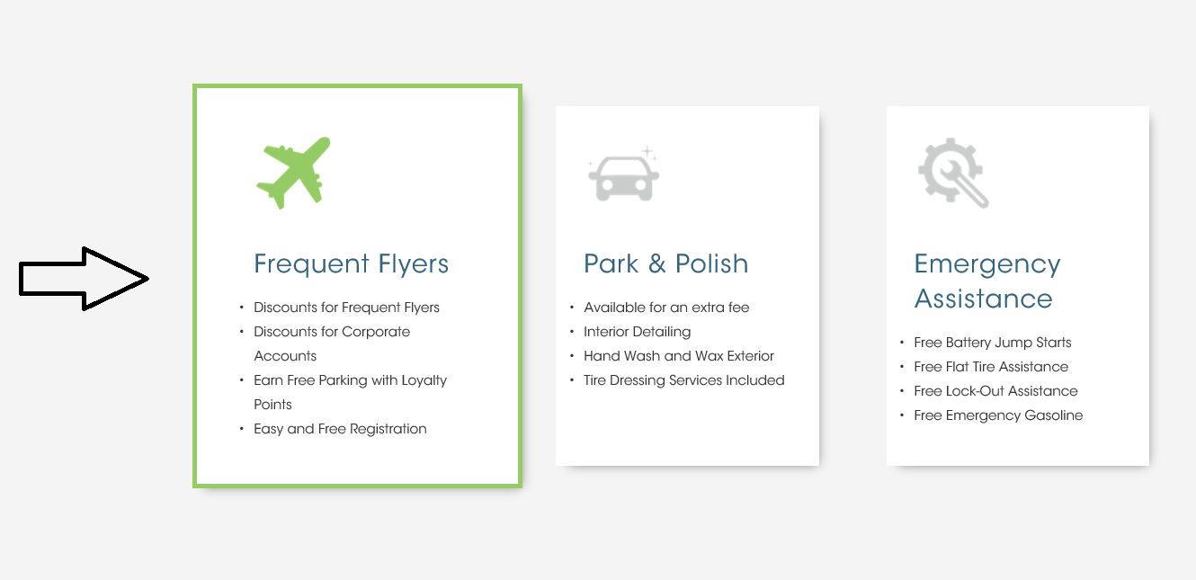
Here is the image block hover effect example: enter image description here

Would someone please direct me in the right direction? What is the CSS?

I'd like to replicate this hover effect on my image blocks.

Thank you for your help,

Mike

2

There are 2 best solutions below

1
On BEST ANSWER

You can play with box-shadows a bit, too, to create a better illusion of depth as the card is hovered or focused. Other details:

  • Flexbox wrapper around cards
  • Grow cards using transform/scale
  • SVG transition on fill property
  • Added transparent border when card is not hovered or focused, to protect against text shift and jumpy behavior during hover/focus

enter image description here

.cards {
  display: flex;
}

.card-image {
  max-width: 50px;
  margin-bottom: 1em;
}

.card-image .svg-icon {
  transition: fill 0.3s cubic-bezier(.25, .8, .25, 1);
}

.card:hover .card-image,
.card:focus .card-image {
  fill: #97cb6f;
}

.card {
  font-family: helvetica;
  box-shadow: 0 1px 3px rgba(0, 0, 0, 0.12), 0 1px 2px rgba(0, 0, 0, 0.24);
  transition: all 0.3s cubic-bezier(.25, .8, .25, 1);
  background: #fff;
  border-radius: 2px;
  margin: 1rem;
  position: relative;
  padding: 1em;
  border: 2px solid transparent;
}

.card:hover,
.card:focus {
  border: 2px solid #97cb6f;
  transform: scale(1.05, 1.05);
  box-shadow: 0 14px 28px rgba(0, 0, 0, 0.25), 0 10px 10px rgba(0, 0, 0, 0.22);
}

.card h2 {
  margin-top: 0;
  font-size: 120%;
}

.card ul {
  padding: 0 0 0 1em;
}

.card li {
  margin-bottom: .5em;
}
<div class="cards">
  <div class="card" tabindex="0">
    <div class="card-image">
      <svg class="svg-icon" viewBox="0 0 20 20">
       <path d="M17.896,12.706v-0.005v-0.003L15.855,2.507c-0.046-0.24-0.255-0.413-0.5-0.413H4.899c-0.24,0-0.447,0.166-0.498,0.4L2.106,12.696c-0.008,0.035-0.013,0.071-0.013,0.107v4.593c0,0.28,0.229,0.51,0.51,0.51h14.792c0.28,0,0.51-0.229,0.51-0.51v-4.593C17.906,12.77,17.904,12.737,17.896,12.706 M5.31,3.114h9.625l1.842,9.179h-4.481c-0.28,0-0.51,0.229-0.51,0.511c0,0.703-1.081,1.546-1.785,1.546c-0.704,0-1.785-0.843-1.785-1.546c0-0.281-0.229-0.511-0.51-0.511H3.239L5.31,3.114zM16.886,16.886H3.114v-3.572H7.25c0.235,1.021,1.658,2.032,2.75,2.032c1.092,0,2.515-1.012,2.749-2.032h4.137V16.886z"></path>
      </svg>
    </div>
    <h2>Some Title</h2>
    <ul>
      <li>Great</li>
      <li>Greater</li>
      <li>Greatest</li>
    </ul>
  </div>

</div>

jsFiddle

2
On

When the image gets hovered, you can scale it using transform property and add border to it. Below is a sample css code, replace it with your class name

   .myimg {
      transition: all .4s ease-in;

    }

    .myimg:hover {
      transform: scale(1.1);
      border: 5x solid green;
      box-shadow: 2px 2px 10px #333;
    }
<img src="https://www.dike.lib.ia.us/images/sample-1.jpg" class="myimg"/>