Sample Distribution Simulation not resulting in Normal

326 Views Asked by At

I was trying to simulate "Sampling Distribution of Sample Proportions" using Python. I tried with a Bernoulli Variable as in example here

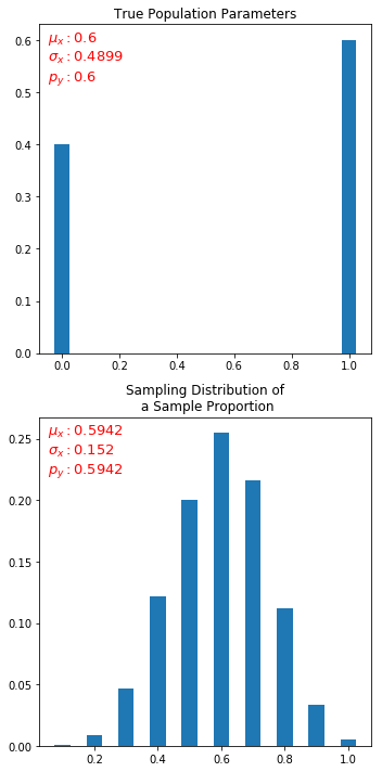
The crux is that, out of large number of gumballs, we have yellow balls with true proportion of 0.6. If we take samples (of some size, say 10), take mean of that and plot, we should get a normal distribution.

I tried to do in python but I only always get uniform distribution (or flats out in the middle). I am not able to understand what am I missing.

Program:

from SDSP import create_bernoulli_population, get_frequency_df
from random import shuffle, choices
from bi_to_nor_demo import get_metrics, bare_minimal_plot
import matplotlib.pyplot as plt


N = 10000  # 10000 balls
p = 0.6    # probability of yellow ball is 0.6, and others (1-0.6)=>0.4
n_pickups = 1000       # sample size
n_experiments = 100  # I dont know what this is called 


# generate population
population = create_bernoulli_population(N,p)
theor_df = get_frequency_df(population)
theor_df

# choose sample, take mean and add to X_mean_list. Do this for n_experiments times
X_hat = []
X_mean_list = []
for each_experiment in range(n_experiments):
    X_hat = choices(population, k=n_pickups)  # this method is with replacement
    shuffle(population)
    X_mean = sum(X_hat)/len(X_hat)
    X_mean_list.append(X_mean)

# plot X_mean_list as bar graph
stats_df = get_frequency_df(X_mean_list)
fig, ax = plt.subplots(1,1, figsize=(5,5))
X = stats_df['x'].tolist()
P = stats_df['p(x)'].tolist()    
ax.bar(X, P, color="C0") 

plt.show()

Dependent functions:
bi_to_nor_demo
SDSP

Output:
enter image description here

Update: I even tried uniform distribution as below but getting similar output. Not converging to normal :(. (using below function in place of create_bernoulli_population)

def create_uniform_population(N, Y=[]):
    """
    Given the total size of population N, 
    this function generates list of those outcomes uniformly distributed
    population list
    N - Population size, eg N=10000
    p - probability of interested outcome  
    Returns the outcomes spread out in population as a list
    """
    uniform_p = 1/len(Y)
    print(uniform_p)
    total_pops = []
    for i in range(0,len(Y)):
        each_o = [i]*(int(uniform_p*N))
        total_pops += each_o
    shuffle(total_pops)    
    return total_pops
3

There are 3 best solutions below

0
On

Solution:
I guess I have arrived at the solution. By reverse engineering Rajesh's approach and taking hint from Daniel if graph could be an issue, finally I have figured out the culprit: default bar graph width being 0.8 is too wide to show my graph as flattened on top. Below is modified code and output.

from SDSP import create_bernoulli_population, get_frequency_df
from random import shuffle, choices
from bi_to_nor_demo import get_metrics, bare_minimal_plot
import matplotlib.pyplot as plt

N = 10000  # 10000 balls
p = 0.6    # probability of yellow ball is 0.6, and others (1-0.6)=>0.4
n_pickups = 10       # sample size
n_experiments = 2000  # I dont know what this is called 


# THEORETICAL PDF
# generate population and calculate theoretical bernoulli pdf
population = create_bernoulli_population(N,p)
theor_df = get_frequency_df(population)


# STATISTICAL PDF
# choose sample, take mean and add to X_mean_list. Do this for n_experiments times. 
X_hat = []
X_mean_list = []
for each_experiment in range(n_experiments):
    X_hat = choices(population, k=n_pickups)  # choose, say 10 samples from population (with replacement)
    X_mean = sum(X_hat)/len(X_hat)
    X_mean_list.append(X_mean)
stats_df = get_frequency_df(X_mean_list)


# plot both theoretical and statistical outcomes
fig, (ax1,ax2) = plt.subplots(2,1, figsize=(5,10))
from SDSP import plot_pdf
mu,var,sigma = get_metrics(theor_df)
plot_pdf(theor_df, ax1, mu, sigma, p, title='True Population Parameters')
mu,var,sigma = get_metrics(stats_df)
plot_pdf(stats_df, ax2, mu, sigma, p=mu, bar_width=round(0.5/n_pickups,3),title='Sampling Distribution of\n a Sample Proportion')
plt.tight_layout()
plt.show()

Output:
output_solved

3
On

can you please share your matplotlib settings? I think you have the plot truncated, you are correct in that the sample distribution of the sample proportion on a bernoulli should be normally distributed around the population expected value ...

perhaps using something as:

plt.tight_layout()

to check if there are no graph issues

8
On
def plotHist(nr, N, n_):
    ''' plots the RVs'''
    x = np.zeros((N))
    sp = f.add_subplot(3, 2, n_ )

    for i in range(N):    
        for j in range(nr):
            x[i] += np.random.binomial(10, 0.6)/10 
        x[i] *= 1/nr
    plt.hist(x, 100, normed=True, color='#348ABD', label=" %d RVs"%(nr));
    plt.setp(sp.get_yticklabels(), visible=False)


N = 1000000   # number of samples taken
nr = ([1, 2, 4, 8, 16, 32])

for i in range(np.size(nr)):
    plotHist(nr[i], N, i+1)

Above is a code sample based on a general blog I wrote on CLT: https://rajeshrinet.github.io/blog/2014/central-limit-theorem/

Essentially, I am generating several random numbers (nr) from a distribution in the range (0,1) and summing them. Then I see, how do they converge as I increase the number of the random numbers.

Here is a screenshot of the code and the result.