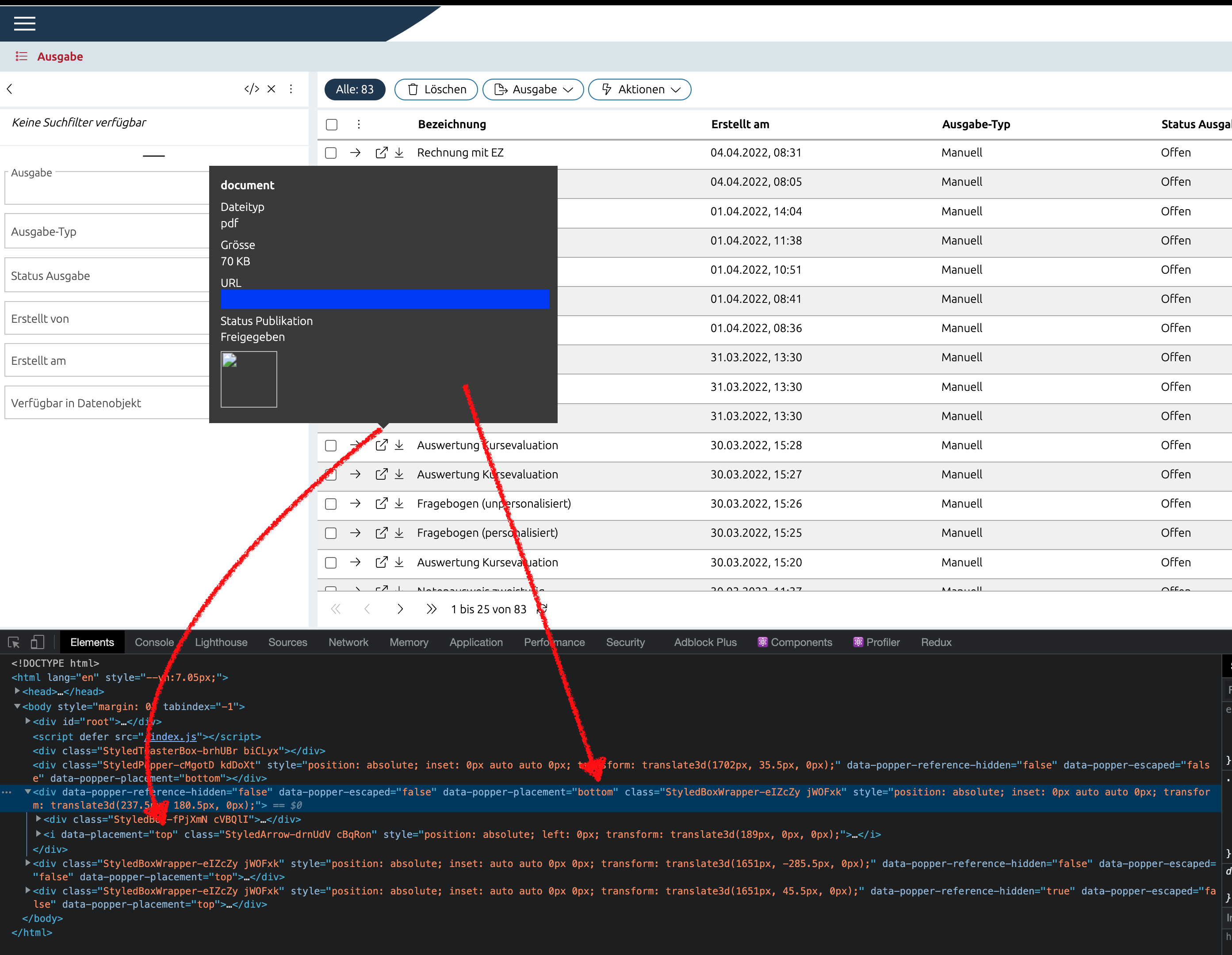
I am currently trying to fix a bug that appeared when using react-popper. It seems that the placement prop is false when there is not enough space above the reference element. In the Screenshot below I can see that the placement prop is top even though it should be bottom. However, it is rather strange that the popper element itself has the correct prop of bottom inside the data-popper-placement prop.
The arrow in the screenshot should be placed at the beginning of the popover not at the bottom.
The JSX
import PropTypes from 'prop-types'
import React, {useState} from 'react'
import ReactDOM from 'react-dom'
import {usePopper} from 'react-popper'

import {StyledArrow, StyledBox, StyledBoxWrapper} from './StyledPopover'

const placements = {
  TOP: 'top',
  BOTTOM: 'bottom',
  RIGHT: 'right'
}

const Popover = ({children, content, isPlainHtml, rimless, placement}) => {
  const [referenceElement, setReferenceElement] = useState(null)
  const [popperElement, setPopperElement] = useState(null)
  const [arrowElement, setArrowElement] = useState(null)
  const [showToolTip, setShowToolTip] = useState(false)

  const handleMouseEnter = () => {
    setShowToolTip(true)
  }

  const handleMouseLeave = () => {
    setShowToolTip(false)
  }

  const modifiers = [
    {
      name: 'offset',
      options: {
        offset: [0, 8]
      }
    },
    {
      name: 'preventOverflow',
      options: {
        padding: 10
      }
    },
    {
      name: 'arrow',
      options: {
        element: arrowElement
      }
    }
  ]

  const {styles, attributes} = usePopper(referenceElement, popperElement, {placement, modifiers})

  return (
    <>
      <span ref={setReferenceElement} onMouseOut={handleMouseLeave} onMouseOver={handleMouseEnter}>
        {children}
      </span>

      {showToolTip &&
        content &&
        ReactDOM.createPortal(
          <StyledBoxWrapper ref={setPopperElement} style={styles.popper} rimless={rimless} {...attributes.popper}>
            <StyledBox isPlainHtml={isPlainHtml}>{content}</StyledBox>
            <StyledArrow ref={setArrowElement} data-placement={placement} style={styles.arrow} />
          </StyledBoxWrapper>,
          document.body
        )}
    </>
  )
}

Popover.defaultProps = {
  isPlainHtml: true,
  rimless: false,
  placement: placements.TOP
}

Popover.propTypes = {
  /**
   * Content in the popover.
   */
  content: PropTypes.node,
  /**
   * Reference to the popover.
   */
  children: PropTypes.node,
  /**
   * Remove space between content and border if useful (e.g. content is an image only). Default is {false}.
   */
  rimless: PropTypes.bool,
  /**
   * Add typographic styles for nested content. If content is already completely
   * styled disable this option (e.g. styled-components). Default is {true}.
   */
  isPlainHtml: PropTypes.bool,
  /**
   * Content of the popover
   */
  placement: PropTypes.oneOf(Object.values(placements))
}

export default Popover
The StyledComponents
import styled from 'styled-components'

import {StyledHtmlFormatter} from '../FormattedValue/typeFormatters/HtmlFormatter'
import {declareTypograhpy} from '../Typography'
import {scale, theme} from '../utilStyles'

const ARROW_WIDTH = 16

const StyledBoxWrapper = styled.div`
  && {
    pointer-events: none; // prevent flickering of tooltip
    background-color: ${theme.color('backgroundPopover')};
    max-width: 400px;
    z-index: 100000010;
    padding: ${({rimless}) => (rimless ? '0' : scale.space(0))};
  }
`

const StyledBox = styled.div`
  && {
    ${props => props.isPlainHtml && declareTypograhpy(props, 'html')};

    &,
    h1,
    h2,
    h3,
    h4,
    h5,
    h6,
    p,
    ${StyledHtmlFormatter} {
      color: ${theme.color('paper')};
    }
  }
`

const StyledArrow = styled.i`
  position: absolute;
  width: ${ARROW_WIDTH}px;
  height: ${ARROW_WIDTH / 2}px;
  left: 0;

  &[data-placement*='bottom'] {
    top: ${ARROW_WIDTH / -2}px;

    &:before {
      border-width: 0 ${ARROW_WIDTH / 2}px ${ARROW_WIDTH / 2}px ${ARROW_WIDTH / 2}px;
      border-color: transparent transparent ${theme.color('backgroundPopover')} transparent;
    }
  }

  &[data-placement*='top'] {
    bottom: ${ARROW_WIDTH / -2.5}px;

    &:before {
      border-width: ${ARROW_WIDTH / 2}px ${ARROW_WIDTH / 2}px 0 ${ARROW_WIDTH / 2}px;
      border-color: ${theme.color('backgroundPopover')} transparent transparent transparent;
    }
  }

  &[data-placement*='right'] {
    left: -${ARROW_WIDTH}px;
    top: -6px !important;

    &:before {
      border-width: ${ARROW_WIDTH / 2}px;
      border-color: transparent ${theme.color('backgroundPopover')} transparent transparent;
    }
  }

  &:before {
    content: '';
    display: block;
    border-style: solid;
    width: 0;
    height: 0;
  }
`

export {StyledArrow, StyledBox, StyledBoxWrapper}