I'm using Zurb with inky (their email template language) and sass. Following their guide I have a very simple column setup I'm trying to achieve, three full-width columns stacked on top eachother. The problem is, even with small="12" applied to all of them, they just take up even spacing.
<container>
<row>
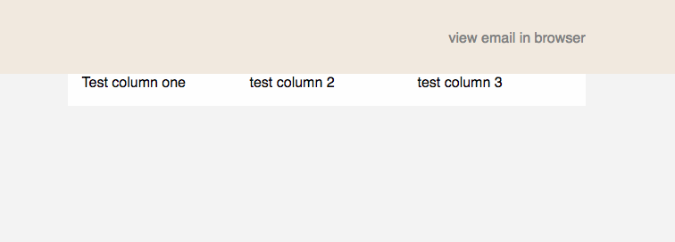
<columns small="12"> test column 1 </columns>
<columns small="12"> test column 2 </columns>
<columns small="12"> test column 3 </columns>
</row>
</container>

While you have the right idea, unfortunately columns and rows don't work quite the way you're thinking -- you simply can't have more than 12 columns. When you specify a combined width greater than 12, the row will attempt to automatically scale the columns to a total of 12. Essentially, having three columns with
small="12"is no different than having three columns withsmall="4".To achieve what you're looking for, you simply need to add three rows instead:
Hope this helps! :)