I have the following html page :
.main {
  display: grid;
  grid-template-columns: 1fr 2fr;
  /*font-size: 55px;*/
}

.main>div {
  height: 200px;
}

.main>div:first-child {
  border: solid 3px red;
}

.main>div:last-child {
  border: solid 3px blue;
}
<div class="main">
<div>
contents 1
</div>
<div>
contents 2
</div>
</div>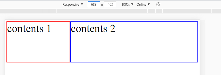 And the result is fine and as I am expecting(the blue div has as twice width as the red div). But when I change the screen size to less than
 246px the blue div started to hide under the browser edge :

How can I keep the ratio of two div in smaller screen sizes ?
Update: font-size has been removed but the problem still exists.

You need to add viewport meta tag and also clean up initial margin and padding of html and body tags
final codes should be as follow