Customize DateRangePicker in flutter

14.1k Views Asked by At

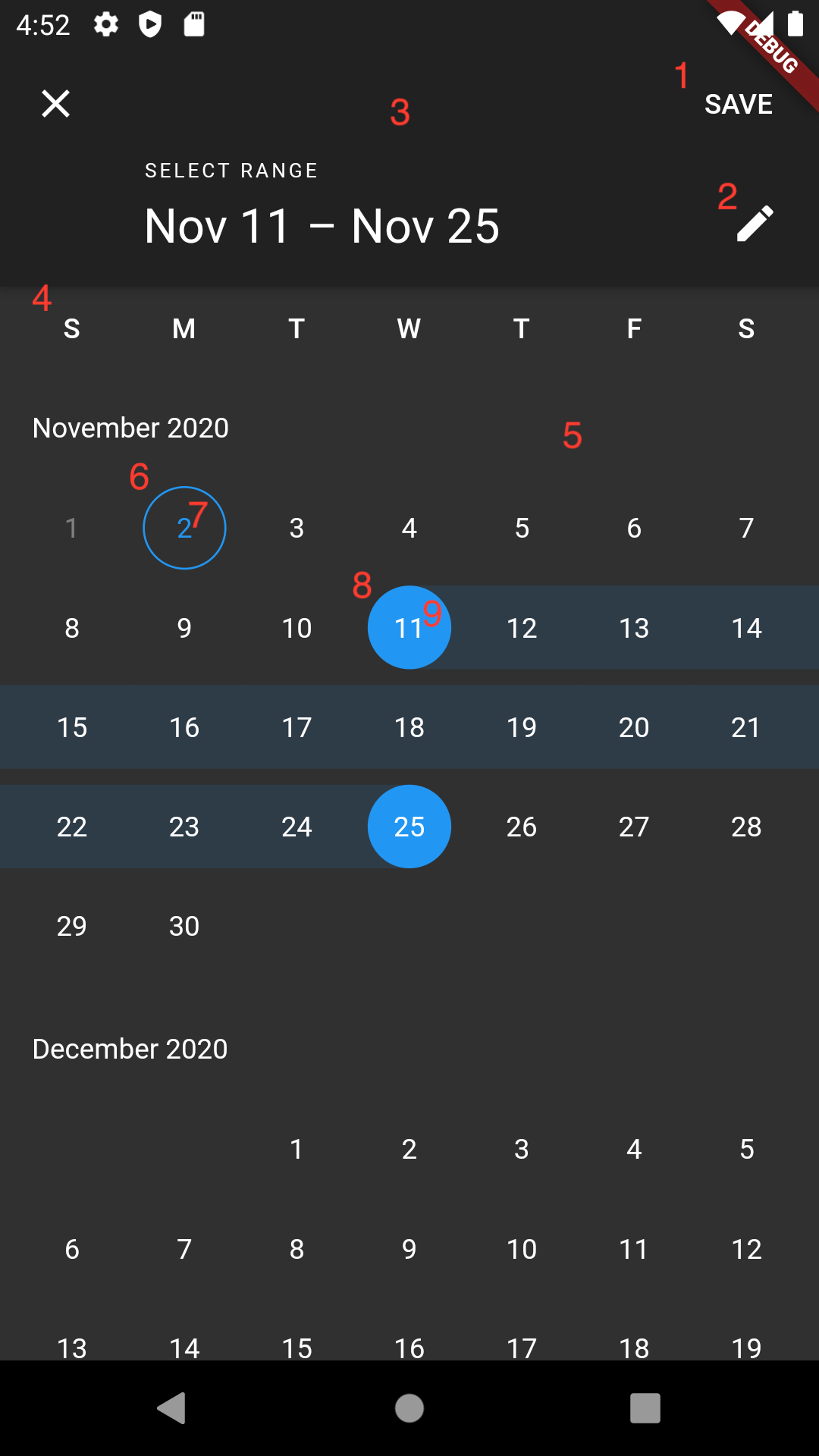
I want to customize DateRangePicker in flutter, How can I change the following elements?

  1. Change the Save button to image.
  2. Remove the Switch to input button.
  3. Change the header background color.
  4. Change day name color.
  5. Change background color.
  6. Change selected item indicator color.
  7. Change selected item text color.
  8. Change selected range indicator color.
  9. Change selected range text color.
showDateRangePicker(
  context: context,
  firstDate: DateTime.now(),
  lastDate: DateTime.now().add(Duration(days: 100)),
  builder: (BuildContext context, Widget child) {
    return Theme(
      data: ThemeData(
        ...
      ),
      child: child,
    );
  },
);

enter image description here

7

There are 7 best solutions below

2
On BEST ANSWER

@Michael Feinstein is right - to elaborate a little bit on what you have to do:

  1. You need to copy date_range_picker_dialog.dart into your lib folder (you get there by clicking 'go to implementation' on showDateRangePicker()
  2. You need to copy calendar_date_range_picker.dart (~ line 577 of date_range_picker_dialog.dart is where the actual picker widget is returned as body of the dialog)
  3. You need to make the adjustments you want to do in both files. Your numbers 1-3 are in the dialog, have a look at the class _CalendarRangePickerDialog and change what you need. For your 6-9 look at _buildDayItem in the range picker file and the other 2 are also easy to find :-)
  4. Don't forget to change the import in your copy of date_range_picker_dialog.dart so that you import your copy of the date_range_picker.dart, instead of the original one.

Now you are all set and good to go.

3
On

I created a package calendar_date_picker2 supporting high-level customisations, just simply wrap it inside a Container and set the container color as the background colors.

enter image description here

0
On

I copy below how to change almost everything you asked in terms of color customization:

showDateRangePicker(
  context: context,
  firstDate: DateTime.now(),
  lastDate: DateTime.now().add(Duration(days: 100)),
  builder: (BuildContext context, Widget child) {
          return Theme(
            data: ThemeData.light().copyWith(
              //Header background color
              primaryColor: Colors.blue,
              //Background color
              scaffoldBackgroundColor: Colors.grey[50],
              //Divider color
              dividerColor: Colors.grey,
              //Non selected days of the month color
              textTheme: TextTheme(
                bodyText2:
                    TextStyle(color: Colors.black),
              ),
              colorScheme: ColorScheme.fromSwatch().copyWith(
                //Selected dates background color
                primary: Colors.blue,
                //Month title and week days color
                onSurface: Colors.black,
                //Header elements and selected dates text color
                //onPrimary: Colors.white,
              ),
            ),
            child: child,
          );
        }
);
0
On

Most of these things can only be changed by modifying the source, as others have said before. You can change the header background color by applying an appBarTheme in the builder callback of showDateRangePicker. The text colors and the selection color can also be set via applying a theme, you need to use a ColorScheme to set them. This example sets the header background to blue, the close icon to white, the header texts + the selected date texts to white, and the selection color to red:

final themeData = Theme.of(context);
showDateRangePicker(
      context: context,
      initialDateRange: initialDateRange,
      firstDate: firstDate,
      lastDate: lastDate,
      currentDate: currentDate,
      initialEntryMode: initialEntryMode,
      helpText: helpText,
      cancelText: cancelText,
      confirmText: confirmText,
      saveText: saveText,
      errorFormatText: errorFormatText,
      errorInvalidText: errorInvalidText,
      errorInvalidRangeText: errorInvalidRangeText,
      fieldStartHintText: fieldStartHintText,
      fieldEndHintText: fieldEndHintText,
      fieldStartLabelText: fieldStartLabelText,
      fieldEndLabelText: fieldEndLabelText,
      locale: locale,
      useRootNavigator: useRootNavigator,
      routeSettings: routeSettings,
      textDirection: textDirection,
      builder: (context, Widget? child) => Theme(
            data: themeData.copyWith(
                appBarTheme: themeData.appBarTheme.copyWith(
                    backgroundColor: Colors.blue,
                    iconTheme: themeData.appBarTheme.iconTheme!.copyWith(color: Colors.white)),
                colorScheme: ColorScheme.light(
                  onPrimary: Colors.white,
                  primary: Colors.red
                )),
            child: child!,
          ));

Screenshot

0
On

I'm too late to answer that question. But I think it will useful for someone.

I used syncfusion_flutter_datepicker packaged. It gives lot of customisation that we want. try it out

0
On

For that level of customization you will need to get the source code, copy it, and then make your own widget modifying that source code.

0
On

You have could do this in two ways:

  • Fork a library which has the code to create something similar to this and then edit the code directly and customize how you want

  • Look for a library which allows more customizing to the date picker, below are a few: