I have been trying to reproduce this plot using the code from here
My last attempts got me pretty close but I can't find the appropiate way to make the graph look like I want. In my data, z is the numerical result of a simulation carried out under x and y conditions and I want to map that relationship, like you could do simply by a scatterplot but prettier.
My df is pretty large but it has this aspect:
- x -> continous variable ranging from 120 - 300
- y -> continous variable ranging from 0.2 - 1.8
- z -> continous variable ranging from -0.0001 to 3000
This is my First attempt generated with this code
levelplot(z ~ x * y,
          data,
          panel = panel.levelplot.points,
          cex = 0.7,
          col.regions = rocket(25, alpha = .8, direction = -1),
          colorkey = list(at = (breaks = c(1, 20, 50, 150, 500, Inf))),
          scales = list(x=list(at = c(120, 140, 160, 180, 200, 220, 240, 260, 280, 299))),
          xlab = "x",
          ylab = "y"
) +
  layer_(panel.2dsmoother(..., n = 100))
The problem is that, while points are a fair representation of my data, the 2d layer is not. I want to specially stress the difference between <1 and >=1 so my breaks start by 1, the rest would be the scale depending on z values for different experiments (this one reaches over 3000, other just up to 30)
I have also attempted to sepparate both graphs and you can take a look at the scatter plot and the 2dSmooth panel. Here is the code for both:
## Scatter
levelplot(z ~ x * y,
          data,
          panel = panel.levelplot.points,
          cex = 0.7,
          at = c(-Inf, 1, 30, 100, 500, Inf),
          col.regions = rocket(25, alpha = .8, direction = -1),
          colorkey = list(
            labels = c("", "1", "30", "100", "500", "")
          ),
          scales = list(x=list(at = c(120, 140, 160, 180, 200, 220, 240, 260, 280, 299))),
          xlab = "x",
          ylab = "y" )

## 2dSmooth
levelplot(z ~ x * y,
          data,
          panel = panel.2dsmoother,
          n = 200,
          cuts = 5,
          col.regions = rocket(25, alpha = .8, direction = -1),
          colorkey = T,
          scales = list(x=list(at = c(120, 140, 160, 180, 200, 220, 240, 260, 280, 299))),
          xlab = "x",
          ylab = "y"
)
Note I am having troubles with CUT and AT. When I pass the AT argument to my 2dSmooth graph, the result is absurd and I have no idea why.
However, the CUT result from the 2dSmooth plot are addequate, the problem is that I cannot label them as I don't know the limits the function has taken. If there would be a way of correctly labelling that graph, that would be it. Otherwise, I need to combine both.
¿Any idea where I am messing up? ¿Any possibility of having my 2dsmooth graph done with other libraries? So far I haven't found anything similar to levelplot() with panel.2dsmoother
Thank you for your help

Your problem seems very specific to your data, so it's difficult to answer without having access to it. But generally speaking,
I'm a bit surprised that you are getting a different set of cut points with your 2dSmooth graph, because when you don't specify
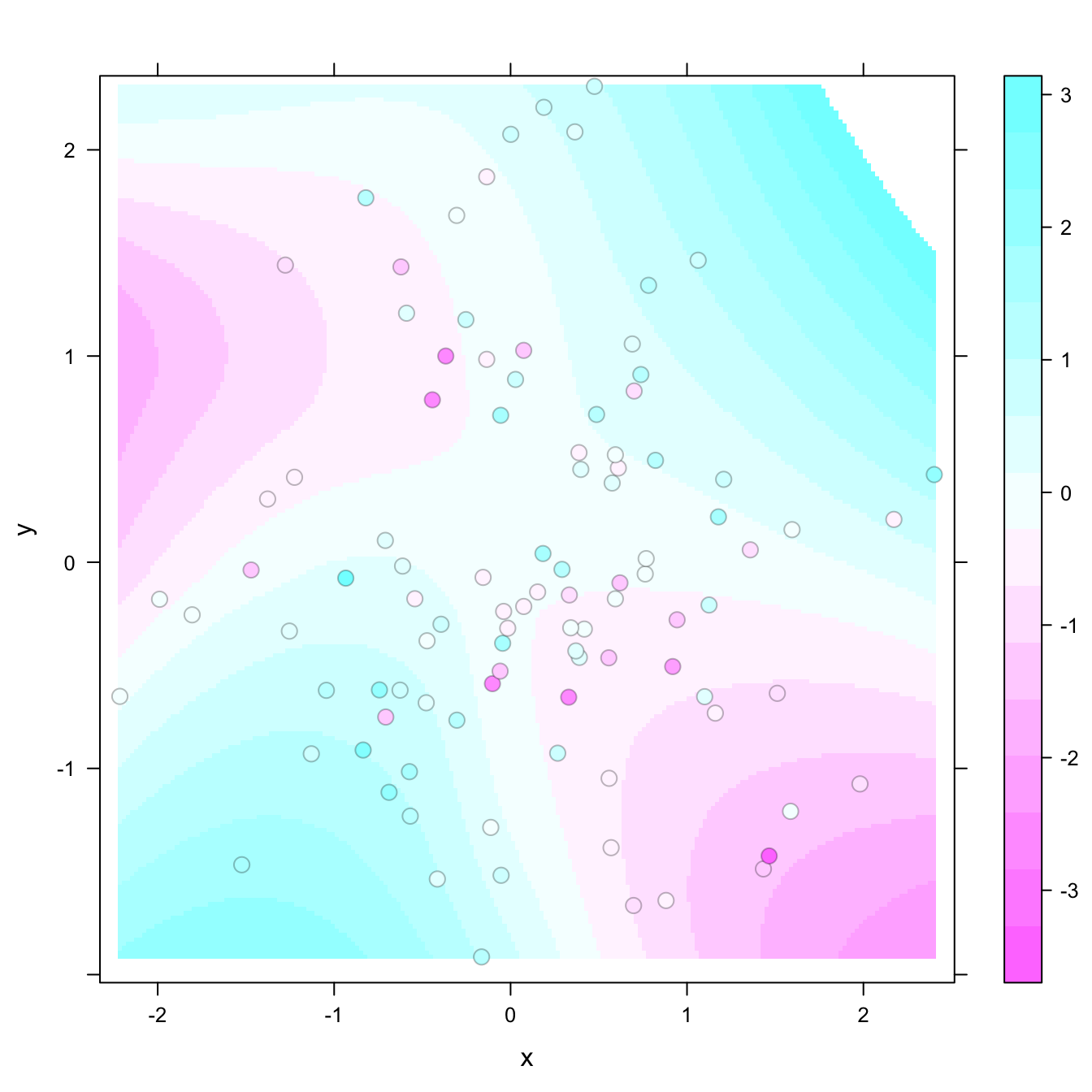
at, the default values should only depend on the data (which remain unchanged) and not on the panel function. I'm not sure what's happening.panel.2dsmoother()basically just fits a regression surface to your data, by default usingloess(). If your goal is to remove the influence of "outliers" by tuning youratvalues to the fitted surface instead of the data, you would need to do that externally. You can mimic the code ofpanel.2dsmoother()to do this, e.g.,You could now visualize this surface using a standard
levelplot()call usingand the corresponding
atvalues should be roughlyYou can get the exact values using