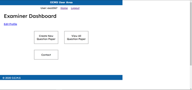
I want to Stretch this BLUE BAR, from one end of the screen to the other end. Now it is stretching 980px. Depending upon the screen size it should span itself from one end to the other end.
If I increase 980px, allignment will change. How to make the bar responsive ?
What CSS should I use ?
html {
  height: 100%;
  width: 100%;
}

body {
  height: 980px;
  width: 100%;
  margin: 0;
  padding: 0;
}

header {
  width: 980px;
  height: 40px;
  margin: 0 0 10px 0;
  padding: 0;
  background: #0B61A5;
  color: white;
}

navigation {
  width: 980px;
  margin: 0;
  padding: 0;
  text-align: center;
}

navigation ul {
  width: 980px;
  list-style: none;
  padding: 0;
  margin: 0;
}

navigation ul li {
  display: inline;
  margin-right: 1em;
}

footer {
  width: 940px;
  height: 20px;
  margin: 0 0 10px 0;
  padding: 10px 20px;
  background: #0B61A5;
  color: white;
}
<html>
 <body>

  <header>
   <h1>OEMS User Area</h1>
  </header>

  <navigation>
   <ul>
    <li>User: </li>
    <li> <a href="">Home</a> </li>
    <li> <a href="">Logout</a> </li>
   </ul>
  </navigation>

  <footer> O.E.M.S </footer>

 </body>
</html>
You should use width:100% to stretch the header to full width for any device size. If you want other design for the different device sizes, use media queries. Learn more about responsive design at https://www.w3schools.com/css/css_rwd_mediaqueries.asp