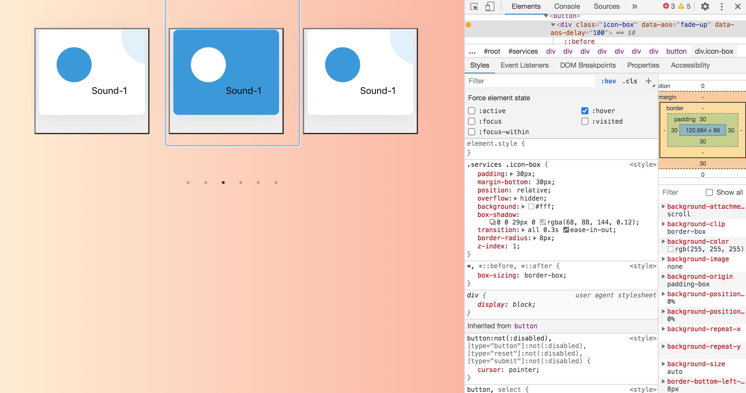
Basically, currently my card's style changes when it is hovered on, but I want that same style to be executed when it is clicked. I've tried using :active and :focus but that only seems to change the style till the time that card is clicked.
Here is the link to my repo: https://github.com/abhudaym/soundboard
Here is my App.js
import React from 'react';
import useSound from 'use-sound';
import Slider from 'react-slick';
import logo from './logo.svg';
import snare from './sounds/snare.mp3';
import './App.css';

import 'slick-carousel/slick/slick.css';
import 'slick-carousel/slick/slick-theme.css';

import 'bootstrap/dist/css/bootstrap.css';
import rollingChair from './sounds/rolling-office-chair.wav';
import quietOffice from './sounds/office-quiet.mp3';
import busyOffice from './sounds/busy-office.wav';
import officeTyping from './sounds/office-typing.wav';
import phone from './sounds/phone.wav';
import ac from './sounds/ac.wav';
import coffeeMachine from './sounds/coffeeMachine.wav';
import photocopier from './sounds/photocopier.wav';
import rainOnWindows from './sounds/rainOnWindows.wav';

function App() {
  const [play1, { stop1 }] = useSound(rollingChair);
  const [play2, { stop2 }] = useSound(quietOffice);
  const [play3, { stop3 }] = useSound(busyOffice);
  const [play4, { stop4 }] = useSound(officeTyping);
  const [play5, { stop5 }] = useSound(phone);
  const [play6, { stop6 }] = useSound(ac);
  const [play7, { stop7 }] = useSound(coffeeMachine);
  const [play8, { stop8 }] = useSound(photocopier);
  const [play9, { stop9 }] = useSound(rainOnWindows);
  const [playSnare, { stopSnare }] = useSound(snare);

  const settings = {
    dots: true,
    infinite: true,
    speed: 500,
    autoplay: true,
    slidesToShow: 3,
    slidesToScroll: 1,
    arrows: false,
  };

  return (
    <section id='services' className='services'>
      <div className='container text-center my-auto'>
        <Slider {...settings}>
          <div className='mb-5 mb-lg-0 row'>
            <button onClick={play1} onMouseLeave={stop1}>
              <div className='icon-box' data-aos='fade-up' data-aos-delay='100'>
                <div className='icon'>
                  <i className='fas fa-robot'></i>
                </div>
                Sound-1
              </div>
            </button>
          </div>
        </Slider>
      </div>
    </section>
  );
}

export default App;
Here is my App.css
body{
  background-image: linear-gradient(to right, #ffecd2 0%, #fcb69f 100%);
}

.services .icon-box {
  padding: 30px;
  margin-bottom: 30px;
  position: relative;
  overflow: hidden;
  background: #fff;
  box-shadow: 0 0 29px 0 rgba(68, 88, 144, 0.12);
  transition: all 0.3s ease-in-out;
  border-radius: 8px;
  z-index: 1;
}

.services .icon-box::before {
  content: '';
  position: absolute;
  background: #e1f0fa;
  right: -60px;
  top: -40px;
  width: 100px;
  height: 100px;
  border-radius: 50px;
  transition: all 0.3s;
  z-index: -1;
}

.services .icon-box:hover::before {
  background: #3498db;
  right: 0;
  top: 0;
  width: 100%;
  height: 100%;
  border-radius: 0px;
}

.services .icon {
  margin: 0 auto 20px auto;
  padding-top: 10px;
  display: inline-block;
  text-align: center;
  border-radius: 50%;
  width: 60px;
  height: 60px;
  background: #3498db;
  transition: all 0.3s ease-in-out;
}

.services .icon i {
  font-size: 36px;
  line-height: 1;
  color: #fff;
}

.services .title {
  font-weight: 700;
  margin-bottom: 15px;
  font-size: 18px;
}

.services .title a {
  color: #111;
}

.services .description {
  font-size: 15px;
  line-height: 28px;
  margin-bottom: 0;
}

.services .icon-box:active .title a, .services .icon-box:active .description {
  color: #fff;
}

.services .icon-box:active .icon {
  background: #fff;
}

.services .icon-box:active .icon i {
  color: #3498db;
}

.row{
  padding: 50px 20px 20px 0px;
}

.r2{
  padding-top: 0px !important;
}

The best way to accomplish what you want is to add an 'active' class to the card when you click on it that contains the same styles as
:hover. In this way, you keep the style whenever you want