I'm creating my own links manually within a module of a divi theme, since divi doesn't support three links side by side.
It's supposed to look like this:
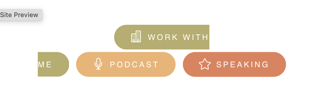
But when the screen is resized it looks like this: Split looking link
Divi breaks its responsive at certain points and this happens before it gets to the tablet size.
This is the code I've placed in the module's css:
a.work {
  background-color: #b7ad68;
  font-size: .5em;
  font-family: "helvetica", san-serif;
  letter-spacing: 2px;
  font-weight: 500;
  padding: 10px 20px 10px 20px;
  border-radius: 50px;
  color: white;
}

a:hover.work {
  background-color: #ffffff;
  border: solid 2px #b7ad68;
  color: #b7ad68;
}

a.podcast {
  background-color: #f1b36e;
  font-size: .5em;
  font-family: "helvetica", san-serif;
  letter-spacing: 2px;
  font-weight: 500;
  padding: 10px 20px 10px 20px;
  border-radius: 50px;
  color: white;
}

a:hover.podcast {
  background-color: #ffffff;
  border: solid 2px #f1b36e;
  color: #f1b36e;
}

a.speak {
  background-color: #e58059;
  font-size: .5em;
  font-family: "helvetica", san-serif;
  letter-spacing: 2px;
  font-weight: 500;
  padding: 10px 20px 10px 20px;
  border-radius: 50px;
  color: white;
}

a:hover.speak {
  background-color: #ffffff;
  border: solid 2px #e58059;
  color: #e58059;
}
<p style="text-align: center;">
<a class="work" href="/work-with-me">
<span style="font-family: ETmodules; font-size: 1.5em; font-weight: 300; padding-top: 10px; position: relative; top: .15em;"></span> WORK WITH ME</a> <a class="podcast" href="/work-with-me"><span style="font-family: ETmodules; font-size: 1.5em; font-weight: 300; position: relative; top: .15em;"></span> PODCAST</a>
<a
class="speak"><span style="font-family: ETmodules; font-size: 1.5em; font-weight: 300;position: relative; top: .15em;"></span> SPEAKING</a>
</p>
These links contain
<span>elements, which are inline by default (same as the<a>tag itself), and therefore will break like regular text. To avoid that, you can define either the spans or those links asinline-blocks, then they won't be split/broken like regular text. For this, add the following rule: