I have the following code in an .aspx page
.cDiv {
  background-color: gray;
}

.tColor {
  background-color:yellow;
}

.tColor2 {
  background-color:blue;
}
<div class="container">
<div class="row">
<div class="col-sm-9 tColor">
Level 1: .col-sm-9
<div class="row">
<div class="col-sm-6 tColor2">
Level 2: .col-sm-6
</div>
<div class="col-sm-6 cDiv">
Level 2: .col-sm-6
</div>
</div>
</div>
</div>
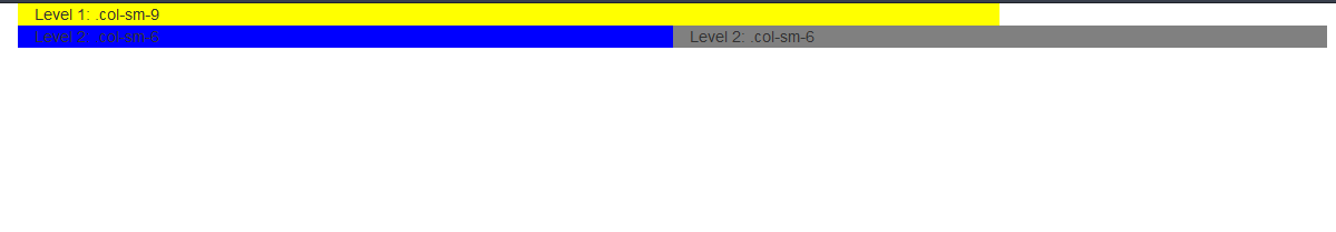
</div>The problem is that the second column gets wider than its parent. I get the following result

I think you forgot to include bootstrap css
Working Demo