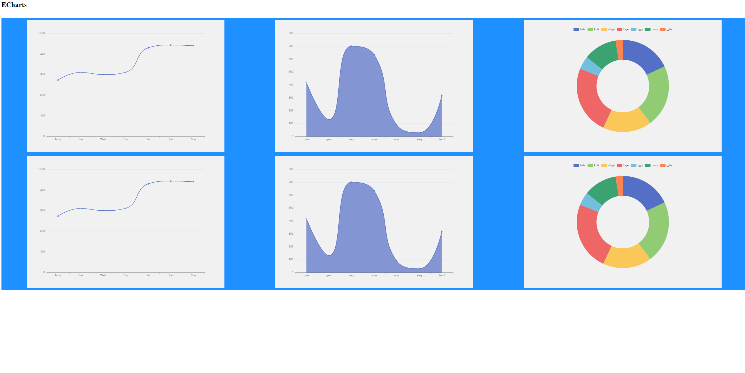
I have seen similar topic with answers about size in % or vh, but its a bit different. I have a set of different plots with sizes 900x600 by default using this CSS:
.chartbox {
    display: flex;
    flex-wrap: wrap;
    background-color: DodgerBlue;
    justify-content: space-around;
}
.chart {
    background-color: #f1f1f1;
    width: 900px;
    height: 600px;
    margin: 10px;
    position: center;
}
And I want them to resize automaticly when the window is resizing (or there is a small screen) Im using charts from ECharts, with js code smth like:
var myChart = echarts.init(document.getElementById('main'));

var option = {
    xAxis: {
        type: 'category',
        data: ['Mon', 'Tue', 'Wed', 'Thu', 'Fri', 'Sat', 'Sun']
    },
    yAxis: {
        type: 'value'
    },
    series: [
    {
      data: [820, 932, 901, 934, 1290, 1330, 1320],
      type: 'line',
      smooth: true
    }
    ]
};

myChart.setOption(option)
My HTML:
<DOCTYPE html>
<html>
    <head>
        <meta charset = "utf-8" />
        <h1>ECharts</h1>
        <link rel="stylesheet" type="text/css" href="mycss.css">
        <!-- Include The ECharts file you just downloaded -->
        <script src = "echarts.js"></script>
    </head>
    <body>
        <br>
        <!-- Prepare a DOM with a defined width and height for ECharts -->
        <div class="chartbox">
            <div class="chart" id= "main"></div>
            <div class="chart" id= "main1"></div>
            <div class="chart" id= "main2"></div>
            <div class="chart" id= "main3"></div>
            <div class="chart" id= "main4"></div>
            <div class="chart" id= "main5"></div>

        </div>

        <script src = "myjs.js"></script>
        <script src = "myjs1.js"></script>
        <script src = "myjs2.js"></script>
        <script src = "myjs3.js"></script>
        <script src = "myjs4.js"></script>
        <script src = "myjs5.js"></script>
    </body>
</html>
I tried to use % and vh to .chart height and width, but they conflict with default size. I tried to use max-width and max-height without width and height, but charts do not appear (mb its a ECharts feature). I expect the following:
- if 3 charts 900x600 can fit the screen then place them
- else if 3 charts 600x400 can fit the screen then place them
- else if 2 charts 900x600 can fit the screen then place them
- else if 2 charts 600x400 can fit the screen then place them
- else if 1 charts 900x600 can fit the screen then place it
- else if 1 charts 600x400 can fit the screen then place it
- else resize as it possible

I think this snippet does something similar to your question.
It leverages flex layout and clamp size computation to achieve what you wanted.
Note that the values are not the one you specified (my screen is too small for 3*900px :D)