Smooth CSS gradients

46.4k Views Asked by At

I'm learning how to use CSS gradients.

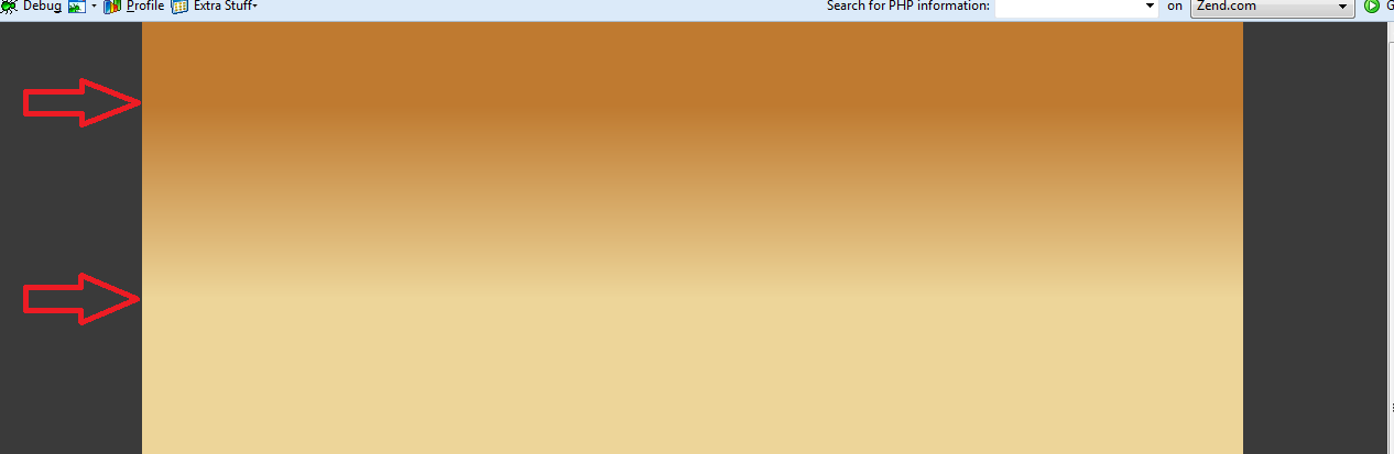
My problem is with top to bottom gradients. You can just see the "stops" in the color changing.

enter image description here

This is my CSS code

#header { 
   width:1000px; 
   height:250px; 
   background:-moz-linear-gradient(top, #BF7A30 30%, #EDD599); 
   background:-webkit-linear-gradient(top, #BF7A30 30%, #EDD599); 
}

Is there a way to smooth out the stops in top to bottom gradients? (this, to my eye, isn't very visible in left to right or right to left gradients)

4

There are 4 best solutions below

3
On BEST ANSWER

Think's below css will suite your need.

CSS :

#header {
    width:1000px;
    height:250px;
    /* IE10 Consumer Preview */ 
background-image: -ms-linear-gradient(bottom, #EDD799 0%, #BF7F37 100%);
    /* Mozilla Firefox */ 
background-image: -moz-linear-gradient(bottom, #EDD799 0%, #BF7F37 100%);
    /* Opera */ 
background-image: -o-linear-gradient(bottom, #EDD799 0%, #BF7F37 100%);
    /* Webkit (Safari/Chrome 10) */ 
background-image: -webkit-gradient(linear, left bottom, left top, color-stop(0, #EDD799), color-stop(1, #BF7F37));
    /* Webkit (Chrome 11+) */ 
background-image: -webkit-linear-gradient(bottom, #EDD799 0%, #BF7F37 100%);
    /* W3C Markup, IE10 Release Preview */ 
background-image: linear-gradient(to top, #EDD799 0%, #BF7F37 100%);
}

http://jsfiddle.net/xPLPH/

Learn more about Linear Gradients: https://developer.mozilla.org/en-US/docs/CSS/linear-gradient

0
On

As @nighthawk2534 mentioned, adding more colors to the gradient is the way to go. Obviously, those have to be "right" colors.

I don't know color theory enough, but stumbled upon a great tool for that: https://mycolor.space/gradient

For your example it gives:

background-image: linear-gradient(to right top, #bf7a30, #ca9148, #d5a861, #e1bf7d, #edd599);

Which looks like that: image

(I know this thread is very old, but still may be helpful)

1
On

Check this out:

background-color: #bf7a30;
background-image: linear-gradient(0deg, #bf7a30 0%, #edd599 46%, #bf7a30 100%);

I generated it real easy from www.gradientcss.com

0
On

The main cause of this bending effect is actually the linear blending of colors, which is not as harmonious to the human eye.

Andreas Larsen has written a pretty elaborate article on css-tricks.com (2017). https://css-tricks.com/easing-linear-gradients/

It describes a concept of non-linear gradients by defining multiple color stops approximating a clothoid curve.

Would result in something like this (.gradient-clothoid):

.gradient-wrp {
  display: flex;
}

.header {
  width: 100%;
  height: 250px;
  flex: 0 0 none;
}

.gradient-linear {
  background-image: linear-gradient(#bf7a30 30%, #edd599);
}

.gradient-smooth {
  background-image: linear-gradient(#bf7a30 25%, 75%, #edd599);
}

.gradient-clothoid {
  background-image: linear-gradient(
    rgba(191, 122, 48, 1) 0%,
    rgba(191, 122, 48, 0.3) 50%,
    rgba(191, 122, 48, 0.15) 65%,
    rgba(191, 122, 48, 0.075) 75.5%,
    rgba(191, 122, 48, 0.037) 82.85%,
    rgba(191, 122, 48, 0.019) 88%,
    rgba(191, 122, 48, 0) 100%
  );
}
<div class="gradient-wrp">
  <div class="header gradient-linear"></div>
  <div class="header gradient-smooth"></div>
  <div class="header gradient-clothoid"></div>
</div>

This concept is also known as "scrim".

IMHO not so well suited for "starting" color stops like the original example:

  • the top 30% of gradient should have 100% color intensity. Probably to ensure better text readability for a heading
  • the remaining 70% should have a smooth color transition.

I actually prefer Amelia Bellamy-Royds’ proposal (article down below in the comments) using a (well supported) gradient smoothing by adding stop without color definition like so:

.gradient-smooth{
   background-image:linear-gradient(#BF7A30 25%, 75%, #EDD599); 
}

This will smooth the gradient between 25% and 75% to the bottom spline based and not linear.

.gradient-linear{
   background-image:linear-gradient(#BF7A30 30%, #EDD599); 
 }