Weird unwanted overflow inside CSS grid

95 Views Asked by At

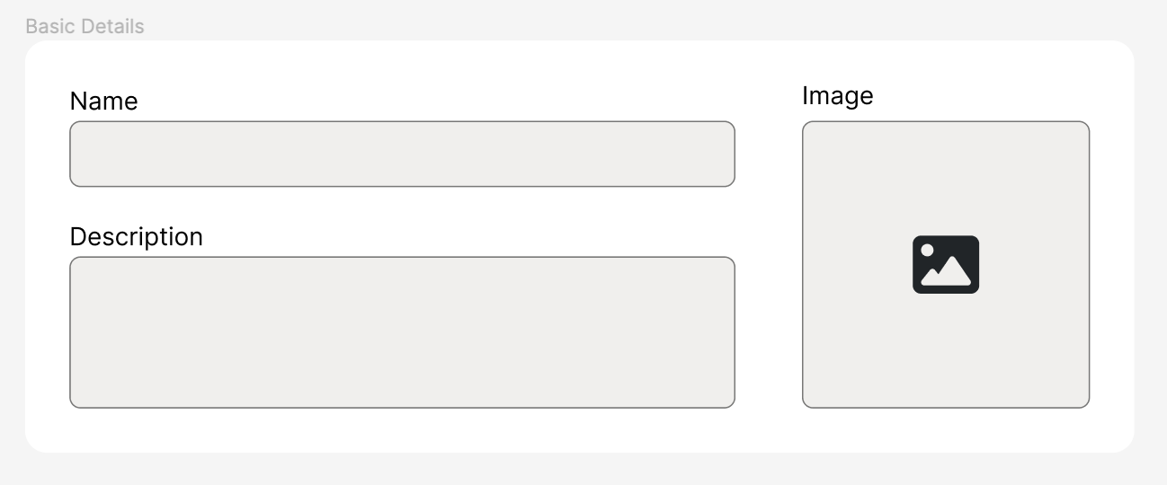
I am trying to make a grid which has two columns. The second column should contain an image input field which should be a square with a 1:1 aspect ratio. The square should be aligned with the bottom of the first column. Basically, the bottom of the image input should reach the bottom of the first column. I made a sketch of what I am trying to do in Figma (see the image).

Note: I cannot use the aspect-ratio property as it doesn't have great enough support yet for my needs. I also want to avoid magic numbers and JavaScript.

What I've tried: Currently, I am using the width: 0; + padding: 0 100%; trick to get a 1:1 aspect ratio. However, the image input is not pushing the other grid column back like I want and is instead overflowing. Additionally, the input doesn't seem to be getting a correct 1:1 aspect ratio either. Any help would be appreciated.

enter image description here

body {
  background: #eee;
}
section {
  margin: 2rem;
  padding: 2rem;
  background: white;
}
input {
  background: #eee;
  border: 0.05rem solid black;
  border-radius: 0.5rem;
  padding: 0.5rem;
}


.grid {
  display: grid;
  grid-template-columns: 1fr auto;
  gap: 2rem;
}
.form-item {
  display: flex;
  flex-direction: column;
  gap: 0.25rem;
}
.form-item ~ .form-item {
  margin-top: 2rem;
}


.image-input-container {
  position: relative;
  height: 100%;
  width: 0;
  padding: 0 100%;
}
.image-input {
  background: #eee;
  border: 0.05rem solid black;
  border-radius: 0.5rem;
  position: absolute;
  inset: 0;
  display: flex;
  align-items: center;
  justify-content: center;
  width: 100%;
  height: 100%;
}
<section>
  <div class="grid">
  
    <div>
      <div class="form-item">
        <label>Name</label>
        <input>
      </div>
      <div class="form-item">
        <label>Description</label>
        <input>
      </div>
    </div>
    
    <div class="form-item">
      <label>Image</label>
      <div class="image-input-container">
        <button class="image-input">+</button>
      </div>
    </div>
    
  </div>
</section>

3

There are 3 best solutions below

0
A Haworth On BEST ANSWER

The width: 0; padding: 0 100%; 'trick' does not work because padding is calculated relative to the containing block width.

As you cannot use aspect-ratio, you could force the right hand column second item to be square for example by having an img element that is square and with the height of the left hand column. Then your div (into which I guess you will eventually place the image the user has chosen) can sit inside that cell taking its dimensions from it, but not affecting those dimensions as it is positioned absolute.

<style>
  body {
    background: #eee;
  }
  
  section {
    margin: 2rem;
    padding: 2rem;
    background: white;
  }
  
  input {
    background: #eee;
    border: 0.05rem solid black;
    border-radius: 0.5rem;
    padding: 0.5rem;
  }
  
  .grid {
    display: grid;
    grid-template-columns: 1fr auto;
    gap: 2rem;
  }
  
  .form-item {
    display: flex;
    flex-direction: column;
    gap: 0.25rem;
  }
  
  .form-item~.form-item {
    margin-top: 2rem;
  }
  
  .image-input-container {
    position: relative;
    height: 100%;
    width: fit-content;
  }
  
  .image-input {
    background: #eee;
    border: 0.05rem solid black;
    border-radius: 0.5rem;
    position: absolute;
    inset: 0;
    display: flex;
    align-items: center;
    justify-content: center;
    width: 100%;
    height: 100%;
    top: 0;
    left: 0;
  }
  
  .dummy {
    height: 100%;
    width: auto;
  }
</style>
<section>
  <div class="grid">

    <div>
      <div class="form-item">
        <label>Name</label>
        <input>
      </div>
      <div class="form-item">
        <label>Description</label>
        <input>
      </div>
    </div>

    <div class="form-item">
      <label>Image</label>
      <div class="image-input-container">
        <img class="dummy" width="1" height="1">
        <button class="image-input">+</button>
      </div>
    </div>

  </div>
</section>

1
ertuozdenli On

section {
  margin: 2rem;
  padding: 2rem;
  background: #eee;
}

.grid {
  display: grid;
  grid-template-columns: 7fr minmax(auto, 1fr);
  gap: 2rem;
}

.form-item {
  display: flex;
  flex-direction: column;
  gap: 0.25rem;
}

.form-item~.form-item {
  margin-top: 2rem;
}

.image_input_container {
  position: relative;
  width: 100%;
  padding-top: 100%;
}

.image_input {
  position: absolute;
  inset: 0;
  display: flex;
  align-items: center;
  justify-content: center;
  width: 100%;
  height: 100%;
  background: white;
}
<section>
  <div class="grid">
    <div>
      <div class="form-item">
        <label>Name</label>
        <input>
      </div>
      <div class="form-item">
        <label>Description</label>
        <input>
      </div>
    </div>
    <div class="form-item">
      <label>Image</label>
      <div class="image_input_container">
        <button class="image_input">+</button>
      </div>
    </div>
  </div>
</section>

Maybe you can use minmax for defining columns and padding-top:100% for keeping aspect ratio. Check it out the sample code, i hope that help.

2
Mehdi On

Maybe this will help, wrapped the 2 input forms and removed padding:100% and width:0

body {
    background: #eee;
  }
  section {
    margin: 2rem;
    padding: 2rem;
    background: white;
  }
  input {
    background: #eee;
    border: 0.05rem solid black;
    border-radius: 0.5rem;
    padding: 0.5rem;
  }
  
  
  .grid {
    display: grid;
    grid-template-columns: 80% 1fr;
    gap: 2rem;
  }

  .input-divs{
    display: flex;
    flex-direction: column;
  }
  
  .form-item {
    display: flex;
    flex-direction: column;
    flex: 1;
    width: 100%;
    gap: 0.25rem;
  }
  .form-item ~ .form-item {
    margin-top: 2rem;
  }
  
  
  .image-input-container {
    position: relative;
    height: 100%;
  }
  .image-input {
    background: #eee;
    border: 0.05rem solid black;
    border-radius: 0.5rem;
    position: absolute;
    inset: 0;
    display: flex;
    align-items: center;
    justify-content: center;
    width: 100%;
    height: 100%;
  }
<section>
    <div class="grid">
        <div class="input-divs">
            <div class="form-item">
            <label>Name</label>
            <input>
            </div>
            <div class="form-item">
            <label>Description</label>
            <input>
            </div>
        </div>
        <div class="form-item">
            <label>Image</label>
            <div class="image-input-container">
            <button class="image-input">+</button>
            </div>
        </div>
    </div>
</section>