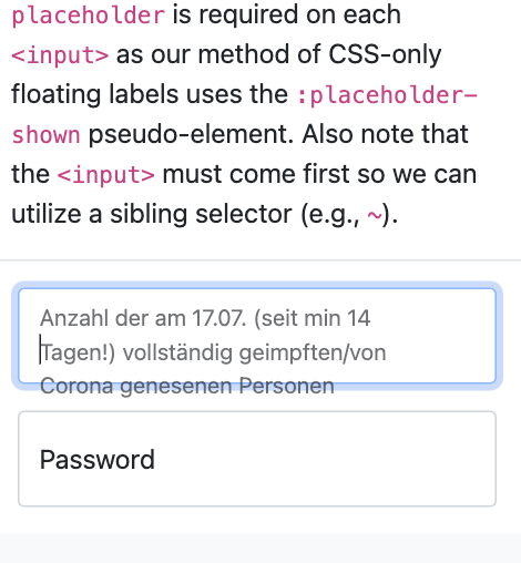
does anyboy have a solution for visualizing longer text without overflow hidden/ellipsis, where the related text is truncated? Cause some questions of input fields make no sense while u just see the half of it.
The problem based on the official Bootstrap 5 example page for floating labels:
Bootstrap 5 floating labels overlapping
1.6k Views Asked by user3714751 At
2
There are 2 best solutions below
1
 Calin Rusu
On
Calin Rusu
On
I used them in a lot of forms on a site and ran into the same problem, longer text labels are overlapping the input and select values. However the solution I used without replacing the entire html to ditch them was to set their position to relative. By default they are positioned as absolute. Just a line of css to change the positioning to relative will make them display under the input element.
.form-floating > label {
    position: relative !important;
}
Related Questions in CSS
- How to use custom font during html to pdf conversion?
- Storing the preferred font-size in localStorage
- mp4 embedded videos within github pages website not loading
- Is there any way to glow this bulb image like a real light bulb
- What can I do to improve my coding on both html and css
- Uncaught TypeError: google.maps.LatLng is not a constructor at init (script.js:7:13)
- Bootstrap modal not showing at the desired position on a web page when the screen size is smaller
- How to increase quality of mathjax output?
- Hover animation resetting( seemingly reverting back to original CSS and then again to hover)when moving mouse horizontaly accross a part of an element
- Storing selected language in localStorage
- How to clip grid cell and provide scroll as well?
- KeyboardAvoidingView makes a messy the flexbox
- Rotate an object around another object in javascript
- Understanding Scroll Anchoring Behavoir
- how to use only block layout in this css code?
Related Questions in TWITTER-BOOTSTRAP
- General questions about creating a custom theme Moodle CMS
- How to fix - The modal dissapear below 992px.?
- Bootstrap horizontal gutters issue
- How can I add a list of icons to the right of a text area
- Why isn't my Bootstrap background color class working as expected?
- Edit button in each row of table using same Bootstrap modal as add button
- Change Opacity of Bootstrap Button
- bootstrap 5 multiple tab dropdown with tab pane
- Bootstrap v5.3 navbar drop-downs not working. Why?
- Should i learn Bootstrap in 2024
- How to turn on Bootstrap Intellisense in .NET 8 Blazor
- Bootstrap 5.3 burger menu not responsive in Underscore WordPress template
- Bootstrap 5 columns not displaying inline
- Bootstrap scaffolding not showing good on mobile
- How to Prevent Select2 Dropdown from Moving with Scroll inside a Bootstrap Vue Modal?
Related Questions in FLEXBOX
- Bootstrap card not collapsing with other cards and merging with cards
- CSS scrolling only on part of website - Flexbox, sidebar
- get size of flex component
- Why are overflowing flex items shown in purple stripes?
- I am findind it dificult to create a box containing text
- How can I get my hero section to look like this?
- React Native Flex:1 working but changing the hierarchy
- Setting a code tag to inline-flex in CSS causes the code containers to expand dramatically in height. And changing height directly breaks the code
- CSS flexbox fit in as many as possible without any empty space
- CSS flex fit in as many as possible without any empty space
- How do I force css grid items to overlap each other?
- Resize divs with default size risizing window
- CSS responsive bug
- Placing links under input
- How to modify flexbox so that one element fills up whole row
Related Questions in BOOTSTRAP-5
- Bootstrap modal not showing at the desired position on a web page when the screen size is smaller
- automatically compare prices with ready-made codes
- Bootstrap card not collapsing with other cards and merging with cards
- Bootstrap component does not want to render in Datatables function
- Bootstrap 5 tooltips not working in Laravel 9.x application
- How to fix - The modal dissapear below 992px.?
- Bootstrap horizontal gutters issue
- What could be the cause of the Bootstrap menu not working?
- Edit button in each row of table using same Bootstrap modal as add button
- Vite Serving Libraries without CDN
- Why can't i click the "register-selection" in bootstrap and JS?
- .NET MVC Bootstrap Modal not showing up
- Are there any ways to add Bootstrap Carousel in CKEditor (django-ckeditor)
- Bootstrap v5.3 navbar drop-downs not working. Why?
- Inline menu items
Related Questions in FLOATING-LABELS
- UITextfield dropdown with floating label
- Label floating not working inside updatepanel c#
- Float label with Vuetify Textarea not resetting above Textarea after pasting and blur
- Bootstrap Floating labels not showing up
- Floating label select box in in react native for IOS/Android/Web
- Floating Label background to be removed while INPUT element is on focus
- Bootstrap 5 - Floating Labels with Razor syntax
- Bootstrap 5 Form Floating Labels are always in the upper position when using flask-wtforms
- Bootstrap 5 floating label on top of the field
- React Bootstrap Floating Label Overlaps Input
- How to add 2nd floating label to input when using 1 div only in bootstrap 5
- Bootstrap 5 - Position floating label inside form-control with width: auto?
- Bootstrap 5 floating labels overlapping
- TypeError: undefined is not an object (evaluating '_reactNativeReanimated.EasingNode.linear')
- Floating labels - label above input field
Trending Questions
- UIImageView Frame Doesn't Reflect Constraints
- Is it possible to use adb commands to click on a view by finding its ID?
- How to create a new web character symbol recognizable by html/javascript?
- Why isn't my CSS3 animation smooth in Google Chrome (but very smooth on other browsers)?
- Heap Gives Page Fault
- Connect ffmpeg to Visual Studio 2008
- Both Object- and ValueAnimator jumps when Duration is set above API LvL 24
- How to avoid default initialization of objects in std::vector?
- second argument of the command line arguments in a format other than char** argv or char* argv[]
- How to improve efficiency of algorithm which generates next lexicographic permutation?
- Navigating to the another actvity app getting crash in android
- How to read the particular message format in android and store in sqlite database?
- Resetting inventory status after order is cancelled
- Efficiently compute powers of X in SSE/AVX
- Insert into an external database using ajax and php : POST 500 (Internal Server Error)
Popular # Hahtags
Popular Questions
- How do I undo the most recent local commits in Git?
- How can I remove a specific item from an array in JavaScript?
- How do I delete a Git branch locally and remotely?
- Find all files containing a specific text (string) on Linux?
- How do I revert a Git repository to a previous commit?
- How do I create an HTML button that acts like a link?
- How do I check out a remote Git branch?
- How do I force "git pull" to overwrite local files?
- How do I list all files of a directory?
- How to check whether a string contains a substring in JavaScript?
- How do I redirect to another webpage?
- How can I iterate over rows in a Pandas DataFrame?
- How do I convert a String to an int in Java?
- Does Python have a string 'contains' substring method?
- How do I check if a string contains a specific word?
You can use autowrap.