Im using flexboxgrid library to create easy responsive layout, I have a parent div styled like so
display: flex;
flex-wrap: wrap;
gap: 2rem;
children have flexboxgrid styling
col-xs-12 col-md-6 col-lg-4
and it works otherwise well, except when I put that 'gap: 2rem' on parent, then div's start overflowing and push last item to another row.
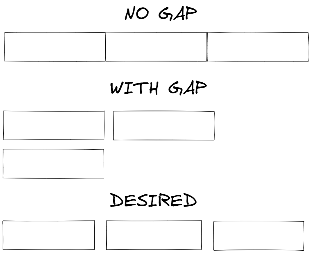
To illustrate problem:
How can I fix it ?
EDIT: Link to CodePen, with gap there is 2 rows, without gap 1 row. How to keep gap, stay on 1 row ?

If you want to spread them out over the whole width, don't set a
flex-basisfor the elements. Rather setflex-grow: 1. This means, that the elements will grow to be as big as possible.If you want to wrap them to a new line, you need to alter your calculation for
flex-basisto also incorporate the gap.